1 Introduction
Starting in the late 1990s, efforts to make more research outputs available have been gathering pace, following increasing requirements from funders, governments, and institutions over the past two decades; changes in publishing business models; and adoption of greater sharing by researchers. Broadly speaking, by saying a research output is open access (OA), we mean that a scholarly research output is available online to read and reuse, free of most copyright restrictions (Suber 2012).
Since 2004, a variety of categories have been developed to represent different aspects of open access, including Gold, Green, Hybrid, Bronze, Grey, Diamond, and Black OA (Section 2.2). These categories were developed by many independent authors, each building on the work of the last. As new developments and debates grew our understanding of the place of open access in the field of academic publishing, so too grew the set of categories with it. The categories are typically represented by a rainbow of colors, metals, and precious gemstones.
Open access is also an area of tension between the interests of publishers, researchers, institutions, funders, and the wider public. In this context, useful debate needs to be supported by usable, transparent, and independent information. While there have been substantial and successful efforts to increase the availability of data on open access performance, most notably through efforts of databases such as Unpaywall, the translation of this data into widely usable information has been less successful.
Tools for visualizing open access performance information do not provide academics, librarians, and other stakeholders worldwide the ability to easily assess their country’s or institution’s performance at open access publishing. Some tools allow filtering of publications using open access categories but don’t provide aggregated information at the country or institution level. Other tools do offer accessible open access performance information but are limited to a specific time period, limited to a specific region, only cover a limited number of institutions, or only consider universities and not other types of research organizations. There are no tools that cover a substantial number of both countries and institutions. Additionally, few tools provide open access rankings, and there are no up-to-date tools that focus on visualizing open access performance by showing a default ranking of countries or institutions based on their percentage of open access publications. If a ranking is provided, it is often sorted initially by country name or publication count (these points are discussed further in Section 2.2).
From embarking on a design process to build a dashboard to visualize open access performance, we came to the position that the current open access categories can often be difficult for end users to understand. The following three issues sum up why we believe these difficulties occur. First, the categories are named after colors, metals, and gemstones, which do not convey the meaning behind the categories. Second, there are many categories all presented at the same abstraction level, making it hard to form a top-down understanding of how they relate to one another. Last, the categories have inconsistent definitions in everyday use and their colors suggest conflicting metaphors, often leading to interpretations that publisher open access is better than repository-based open access.
To address these issues, we have made the following two contributions.
The first contribution is redesigning the open access categories to make them easier to understand. We redesigned the categories using descriptive category names rather than opaque color names, reorganized the categories into a hierarchy to facilitate top-down comprehension, and presented publisher and repository-based open access categories without preferencing one category over another. We wanted to present a different way of interpreting open access performance information that was not driven by the assumption that articles available from publisher websites are more important than articles found on other platforms, such as repositories. Other groups have also come to similar conclusions, including the creators of the French Open Science Monitor (Bracco et al. 2022) and the OpenAIRE OpenScience Observatory (Papastefanatos et al. 2020).
The second contribution is the Curtin Open Knowledge Initiative (COKI) Open Access Dashboard,1 which is designed to enable academics, librarians, and key decision makers to evaluate the open access publishing performance of their country and institution. Our dashboard addresses the lack of country and institution coverage of other tools by providing comprehensive open access statistics for hundreds of countries and over seven thousand institutions worldwide, with more to come. The data for the dashboard is created by synthesizing information from multiple sources, including Crossref Metadata,2 Unpaywall,3 Microsoft Academic Graph,4 and the Research Organization Registry (ROR).5 The authoritative source of Crossref digital object identifiers (DOIs) is provided by Crossref Metadata, open access status by Unpaywall, institutional affiliation and citation count from Microsoft Academic Graph, and organizational information from ROR. Our dataset (Hosking et al. 2022) is frequently updated, enabling policy changes to be assessed in an ongoing fashion.
In the spirit of open infrastructure, design decisions and data transformations are described for the benefit of the community and future maintainers. Instead of claiming neutrality or objectivity, ideologies are stated up front.
2 Related Work
There is a rich history of previous work on visualizing and interpreting open access progress and performance. We begin by providing an overview of the COKI project. Next, we review the history and controversies of open access categorizations and place them in the context of the debates about implementing open access. We then examine dashboards that visualize open access performance and discuss common themes and gaps in current tools. Finally, we briefly discuss the limitations of university ranking systems, which have implications for the design of the dashboard.
2.1 The Curtin Open Knowledge Initiative
COKI is a vibrant research team of critical humanities scholars and data scientists, working together to build a critical mass of knowledge and capability on the application of open knowledge in higher education around the world.6
COKI was founded in 2017 by project leads Professor Cameron Neylon and Professor Lucy Montgomery, supported by a two-year strategic research grant from Curtin University. The initial goal of COKI was to develop tools and data that would allow universities to understand how effectively they are operating as open knowledge institutions and to support strategic change in higher education and research (Montgomery et al. 2021). Over time, COKI has developed into a strategic initiative of the Research Office at Curtin; the Faculty of Humanities, School of Media, Creative Arts and Social Inquiry; and the Curtin Institute for Computation at Curtin University, with additional support from the Mellon Foundation and the Arcadia Fund, which has significantly expanded its scope.
Using big data and cloud computing approaches, COKI aims to create the world’s leading dataset relating to scholarly communication, open access, diversity, and inclusion. Our goal is to ensure that the tools and data used to evaluate university performance support more open and productive practices, so that universities can change the public stories they tell about themselves, and to put open knowledge at the heart of these narratives. At the center of this goal is adopting a critical approach to how we create effective stories from our own data.
In our earlier work (Huang, Neylon, Hosking et al. 2020), our analysis focused on how open access performance at national and institutional levels responded to policy initiatives. In this work, we followed existing category names for open access, although we did focus closely on describing in detail how we implemented those categories in our analysis. One of the first public tools COKI developed was an open access dashboard powered by Data Studio that visualized publications and their open access status over time per country, using the existing open access categories of Gold, Green, Hybrid, and Bronze (described in more detail below). This dashboard was limited to filtering open access statistics by countries only.
Increasingly, we found that the shorthand and assumptions that existing categories implied were hampering our ability to clearly describe changes in the open access landscape. The choices made in naming conventions in the early 2000s were not serving us well in reimagining what future approaches to open access and scholarly communication could look like.
We believe that open access to research outputs is a single but important component of an effective Open Knowledge Institution. By providing timely, transparent, and useful information on open access performance we aim to support advocates in making the case for change, to provide data for decision makers, and to change our shared ideas of what makes a good university. Expanding our initial open access dashboard to include institutions is a key component to achieving this aim.
2.2 Open Access Categories
The categorization of open access through the rainbow of colors, metals, and precious gemstones has a rich history, the product of the debates and positioning of different stakeholders over time.
Stevan Harnad and colleagues (2004, 1) invented the terms Gold OA and Green OA, describing them in the context of two roads to open access. Gold OA is the “golden” road to open access, meaning to “publish your article in an OA journal.” Green OA is the “green” road to open access, meaning to “publish your article in a non-OA journal but also self-archive it in an OA archive.” The color green describes journals giving “their authors the green light to self-archive.” Open access journals and self-archiving started around 1990, long before the gold and green definitions of open access (Björk et al. 2014; Gargouri et al. 2012).
While Harnad and colleagues (2004) originally defined Gold OA to only include open access journals, the term has subsequently been used inconsistently, with some invoking the original definition (Piwowar et al. 2018; Gargouri et al. 2012; Bautista-Puig et al. 2020) and others adding open access outputs from hybrid journals to the category (Costello 2019; Zhang and Watson 2017; Laakso et al. 2011). Hybrid journals are subscription publications in which articles are published as open access under some circumstances, most commonly when the author pays an article processing charge (APC). The remaining articles are “closed access” and can be accessed only by subscribers (Piwowar et al. 2018). The difference between these two approaches is whether Gold OA is defined at the journal level (original definition) or article level (subsequent definition).
Since 2004, Green OA has evolved to encompass more than self-archiving to institutional repositories, including publisher-mediated archiving to platforms such as PubMed Central or author self-archiving to preprint servers (e.g., arXiv) or domain repositories (e.g., EconStor). Access via other platforms can be to multiple different versions of articles: preprints, author manuscripts, pre– and post–peer review, and publisher versions that may or may not have the final journal formatting. This access may be associated with delays of various types or occur before or at publication.
Hybrid OA describes articles that are open access at a subscription publisher after the author pays an APC (Piwowar et al. 2018). Thomas Walker (1988) first proposed the idea of a hybrid journal and used it as a model for the Florida Entomological Society (Prosser 2003). David Prosser (2003, 164) built on this concept, defining a hybrid journal as a publishing model in which authors can either (1) pay a publication charge and “the paper is then made open access on publication” or (2) not pay a publication charge and “the paper is only made available to subscribers.”
Commercial journals began adopting the hybrid model in response to the open access movement, with more pressure building from the introduction of funding agency mandates. This started with Springer and Wiley in 2004; Oxford in 2005; Elsevier and Sage in 2006; and Taylor & Francis, Cambridge, and Nature in 2007 (Weber 2009; Boyes and Kingsley 2016).
When hybrid journals were rare, they were relatively easy to track; however, with a proliferation of new business models for academic publishing,7 there is now a substantial number of journals that are notionally “subscription” but in which only a minority of articles are in fact “closed.” In some cases, fees are paid for publication, and in many cases, they are not. Increasingly, publishing services agreements or “subscribe to open”8 models cover costs in ways that may not always be visible to authors.
Bronze OA describes articles accessible at a publisher, with no reuse rights. Heather Piwowar and colleagues (2018, 6) formally defined the Bronze OA category,9 describing it as “publisher-hosted” articles: “Unlike Gold OA, Bronze articles are not published in journals considered open access in the DOAJ [Directory of Open Access Journals]. Unlike Hybrid, Bronze articles carry no license information. Although this lack of identifiable license may not be intentional, without an identifiable license the articles are free to read but do not allow extended reuse rights beyond reading.” There are several practices in which publishers make specific articles or issues freely available to read with no identifiable license; examples include embargo periods when access becomes free after some period (or is free for some period), promotional access for a limited time, and articles made available during crises such as pandemics.
Some definitions treat Gold, Hybrid, Bronze, and Green OA as mutually exclusive categories, where Gold, Hybrid, and Bronze OA are more important than Green OA (Piwowar et al. 2018). For instance, if an article is Gold, Hybrid, or Bronze OA, the article is not counted as Green OA. A practical reason for making the categories mutually exclusive is that it is easier to create data visualizations. The downside of these discrete categories is that they imply that Gold, Hybrid, and Bronze OA are better or more important than Green OA.
Open access via publisher websites has often been treated as more important than open access via other platforms. Assumptions that underlie this are that publisher access is immediate whereas repository access is delayed, that repositories cannot host the final published version, and that repositories are less visible to search engines. These assumptions are not entirely correct, but there are historical and political reasons for their persistence. The political debate has led to a false dichotomy characterized by a choice between access via publishers (Gold, Hybrid, or Bronze OA) and via other platforms (Green OA). Publishers and scholarly societies have a financial interest in favor of Gold, Hybrid, and Bronze OA over Green OA because they receive revenue from Gold, Hybrid, or Bronze OA articles in the form of APCs (Gold and Hybrid) or subscriptions (Bronze during the embargo period). As a result, the presentation of open access statistics is often based on the assumption that a publication must be either Gold or Green. It has been rare to present information on how many publications are available through both routes. In practice, a large proportion of open access research outputs are available through both mechanisms.
Open access through repositories is important for policy implementation, including articles that are also accessible via publisher websites. The presence of alternative modes of access strengthens the hands of institutions in negotiations for publishing services and subscription access, particularly with “read and publish” agreements becoming more common. Articles accessible via repositories also provide a safety net for access if publisher access is withdrawn or fails. This provides a controlled archive of an institution’s output. For funders, designated repositories have been a powerful means of collating and tracking their funded research outputs. Finally, for publishers of open access content, it can be important to know that copies are available on other sites, particularly where maximizing article usage is part of the service they are offering.
Diamond OA describes open access journals that do not charge authors APCs. Tom Wilson (2007) first defined this concept as the “ ‘Platinum Route’ to open access,” and in his own later words, “I’ve called this the ‘Platinum’ model, to distinguish it from the well-known ‘Green’ and ‘Gold,’ because, unfortunately, ‘Gold’ is often used to cover fee-based publications as well as genuine open access in the Platinum mode” (Wilson 2016). In 2012, the mathematicians from The Cost of Knowledge10 proposed a similar category called Diamond OA (Mac Síthigh and Sheekey 2012; Farge 2018). It was initially termed Free OA, where “neither the author nor the reader pay any fee” (Farge 2012, 1–2), and evolved into Diamond OA, inspired by the “Diamond Sutra, a treasure of the British Library that was printed in 868 in China” (Farge 2018, 74).
Grey OA refers to articles available on websites and academic social networks (ASNs). In their international survey on digital repository use, David Nicholas and colleagues (2012) define Grey OA as the approach of uploading articles to personal websites. They note that three-quarters of respondents who deposited articles in a repository also provided access via their personal or departmental website. Ángel Borrego (2016) further refined the concept of Grey OA to mean “if the full text could be accessed at any other website,” including ASNs and personal or departmental websites. ASNs are platforms where researchers can create profiles, network with other researchers, and upload and share their research works; examples include Academia.edu, ResearchGate, and Mendeley (Zhang and Watson 2018). Some treat ASNs as their own category without considering content found on personal or departmental websites (Piwowar et al. 2018). ASNs do not make it easy to determine what research outputs they cover.11
Black OA describes articles on platforms that host pirated copies of publications. The most popular platforms are Sci-Hub and LibGen (Piwowar et al. 2018). Bo-Christer Björk (2017, 173) coined the term Black OA and described the color black as “Black as in the classical pirate flag, or in black market!” Björk’s definition technically includes content from ASNs in addition to platforms that host pirated content; however, subsequent uses of Black OA typically exclude ASNs (Piwowar et al. 2018; Greshake 2017). In contrast to ASNs, Sci-Hub12 and LibGen13 both provide comprehensive information about the research outputs they cover.
Whether or not articles in the above categories are considered “open” or “closed” is the subject of much debate. Many repositories (Green OA) and all Bronze OA articles do not meet open access definitions that require explicit licenses to allow reuse, for instance, the Budapest Open Access Initiative definition of open access (Piwowar et al. 2018). Observers of the terminology derived from free and open-source software explicitly link “open” to licenses that allow wide reuse. In practice, most make little distinction between “accessible” in some form and reusable forms of “open.” As a result, all Green OA and much of Bronze OA are often considered as open. The case for Grey OA being open is, well, grey: some consider Grey OA as being open (Björk 2016; Archambault et al. 2016), while others do not (Piwowar et al. 2018). The primary reasons for not considering Grey OA as open are that copyright compliance is not checked when authors upload copies to their personal or departmental web pages or ASNs, and there are no guarantees regarding their longevity (Piwowar et al. 2018), which is also a problem with Bronze OA. Finally, despite the immense popularity of Black OA (Elbakyan and Bohannon 2017), due to the breaking of copyright, most commentators do not consider these articles as open (Piwowar et al. 2018).
2.3 Open Access Dashboards
This section provides an overview of dashboards that visualize open access performance, including Open Science Monitor, the French Open Science Monitor, OpenScience Observatory, CWTS Leiden Ranking, Google Scholar, and Lens.org. Web of Science, Scopus, and Dimensions are not included because they only allow for searching of publications based on open access status. While they may provide some analysis of open access categories for search results, usually in the form of output counts, they do not display open access performance metrics.
2.3.1 Open Science Monitor
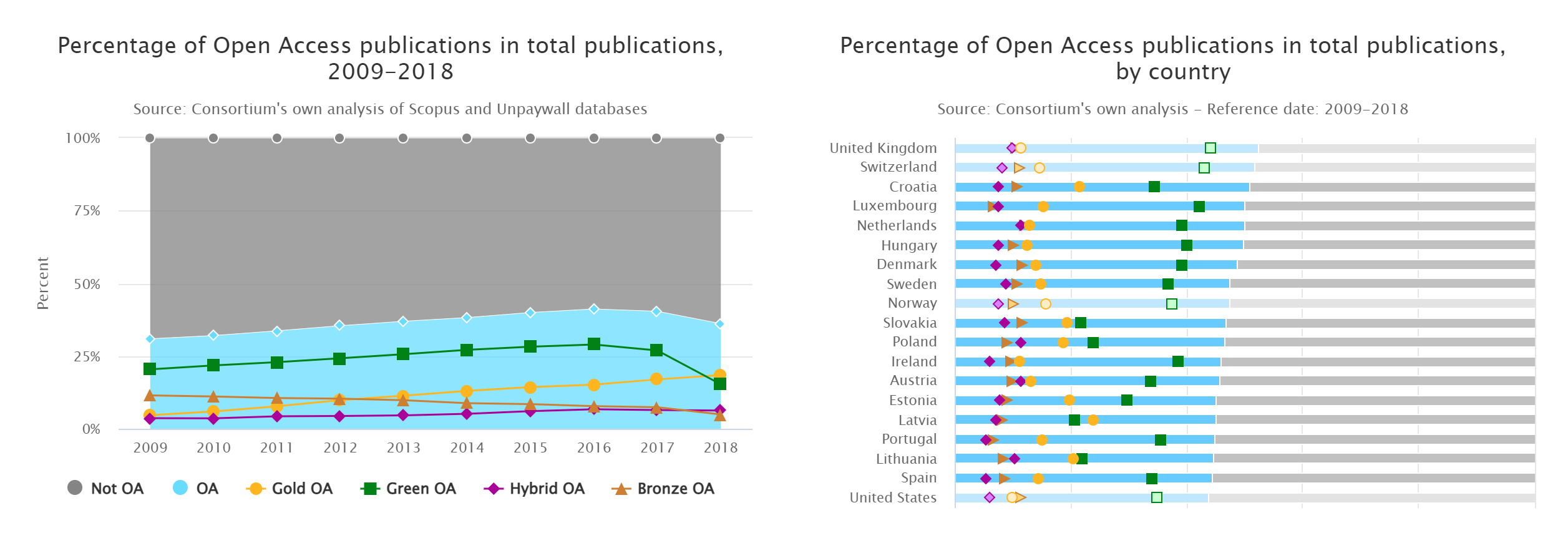
The Open Science Monitor14 is a website created by the European Commission, which visualizes open access statistics for thirty-six countries, primarily from Europe. The Open Science Monitor began as a study in 2017 and was released as a website in 2018 (Papastefanatos et al. 2020). The website covers publications from 2009 to 2018, using data from the Scopus and Unpaywall datasets. Charts displayed include the percentage of open access publications by country, field of study, and publication year; percentage of open access by altmetrics; and number and percentage of funders with policies on open access and archiving, broken down by country. The open access visualizations show statistics for open versus closed access, Gold OA, Green OA, Hybrid OA, and Bronze OA (Figure 1).
2.3.2 French Open Science Monitor
The French Open Science Monitor (Bracco et al. 2022) is a dashboard designed to assess the open access status of French research. This dashboard includes three main components: a general page that provides an overview of all French research, a health page that focuses specifically on French publications in the health field, and institution-specific dashboards for over thirty French institutions.
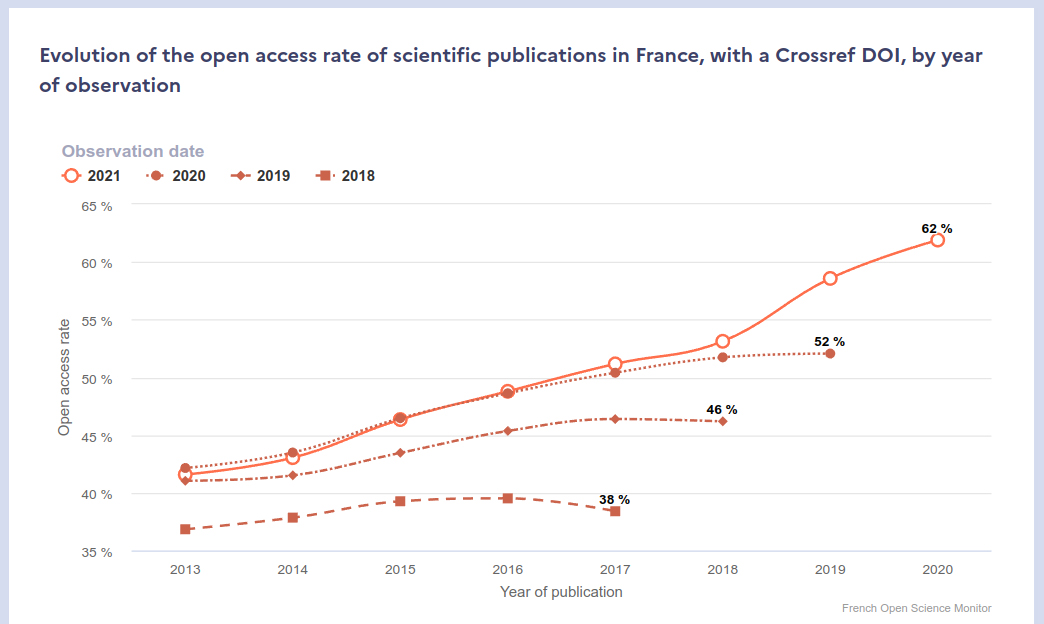
The French Open Science Monitor is unique because it shows how open access has changed over different time periods, rather than just displaying the current open access percentage for each year of publication. It does this by showing the percentage of open access across various years of publication and across different observation years (Figure 2). In terms of open access categorization, the French Open Science Monitor has adopted a different naming convention compared to the traditional categories. The platform uses the categories “publisher” instead of Gold, “publisher and open repositories” as the intersection of Gold and Green, and “open repositories” instead of Green. The authors chose to represent the intersection of Gold and Green because it does not privilege accessibility through the publisher website over repositories.
The general page of the French Open Science Monitor offers a summary of the percentage of open access for each year of observation and the overall growth rate of open access in the past year. It also includes information on the distribution of open access per publication year across different observation periods; overall percentage of open access by category for the latest observation year; open access categories by publication type and language; and detailed breakdowns of open access by field of research, publisher, and open repositories. The health monitor has a subset of these charts along with health-specific charts, and the institution-specific pages have similar charts to the general page, although they differ depending on the specific institution.
2.3.3 OpenAIRE Monitor
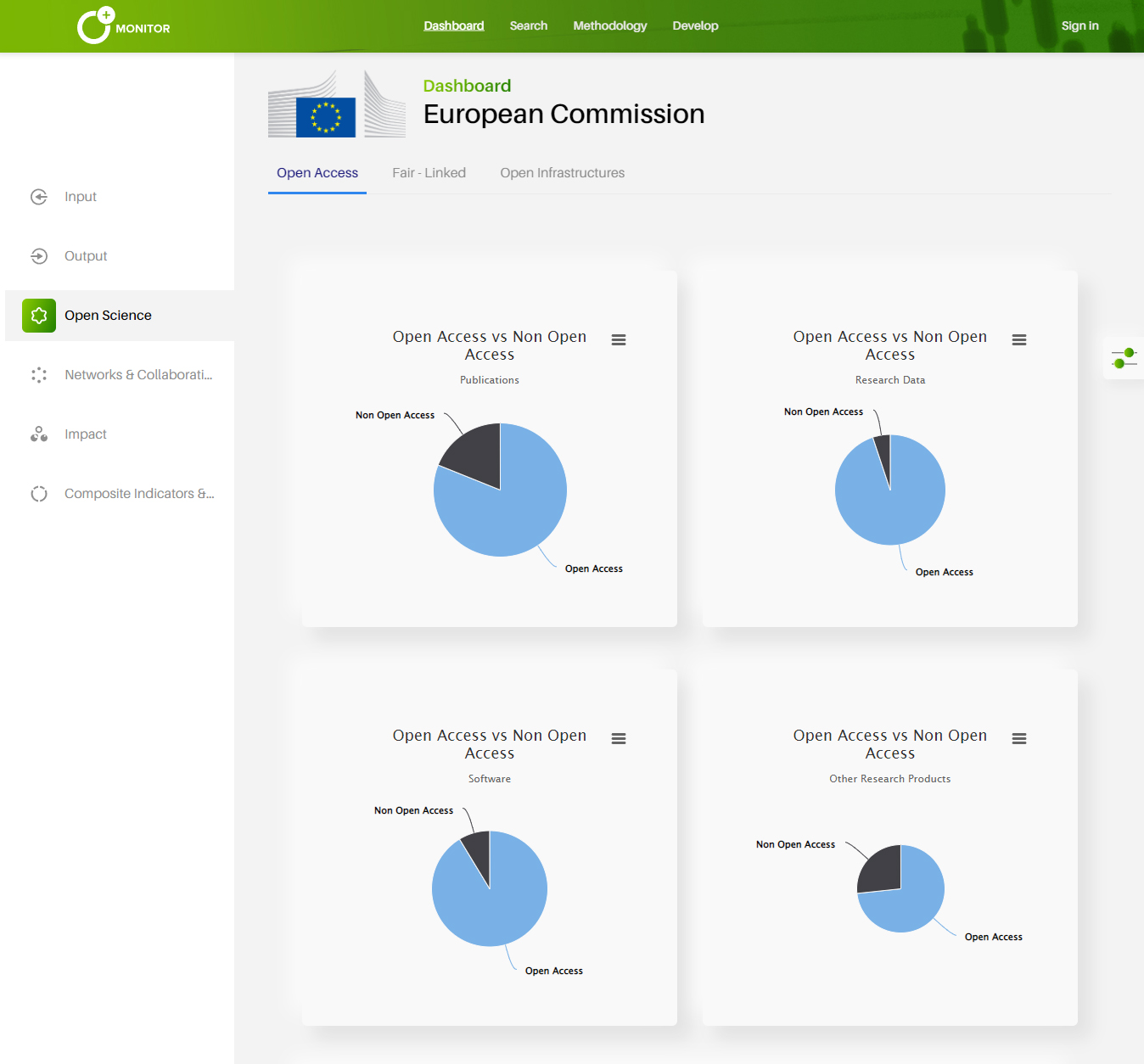
OpenAIRE Monitor17 is a service for creating research dashboards for organizations such as universities, funders, and consortia. Organizations pay OpenAIRE to create custom dashboards that can be public or private. There are currently dashboards for thirty organizations, four of which are public. These dashboards visualize information related to projects, funding, research outputs, open access, and collaborations (Figure 3). The visualizations for each organization are always slightly different; however, in general, the open access section of the dashboard provides visualizations for the total number of open versus closed publications and the number of open and closed publications per year. Some dashboards also provide breakdowns of the previous metrics by publication type and other open access categories, including Green, Gold, Hybrid, and Bronze OA. One dashboard provides breakdowns of top journals and repositories by open access type. OpenAIRE Monitor uses data from the OpenAIRE Research Graph18 and is updated every two to four weeks.
2.3.4 OpenScience Observatory
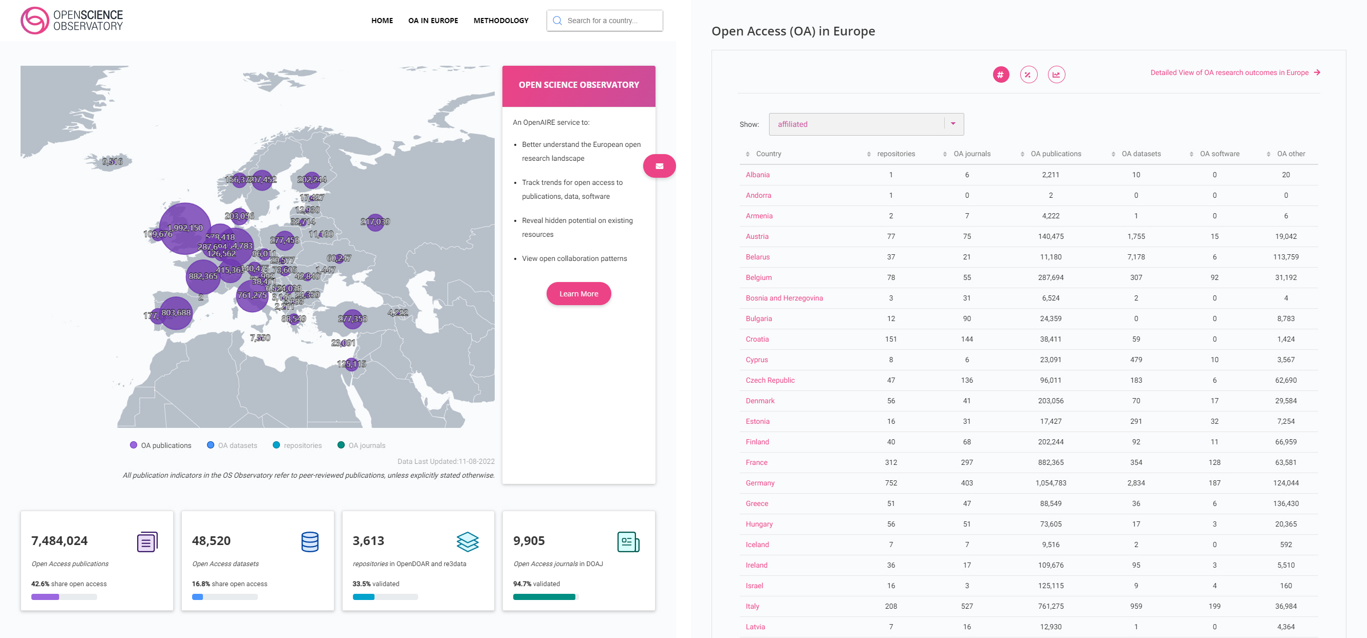
The OpenScience Observatory (Papastefanatos et al. 2020) is an interactive dashboard created by OpenAIRE that visualizes open access statistics for forty-four countries, primarily of European origin, and provides a summary page for Europe. The home page features a map of Europe that visualizes the number of open access publications, datasets, repositories, and journals for each European country, as well as aggregate statistics for Europe as a whole (Figure 4). Below the map and aggregate statistics is a table with all countries, default sorted by country name, with the number and percentage of open access publications, datasets, software, and other output types. Users can navigate to individual country profile pages from the table or via a search box. The country profile pages contain aggregate statistics and charts related to open access. The open access charts use an interpretation of the open access categories that treat Gold and Green equally, displaying “Gold OA only,” “both Gold & Green OA,” “Green OA only,” and “neither.” The OpenScience Observatory uses data from the OpenAIRE Research Graph and is regularly updated.
2.3.5 CWTS Leiden Ranking
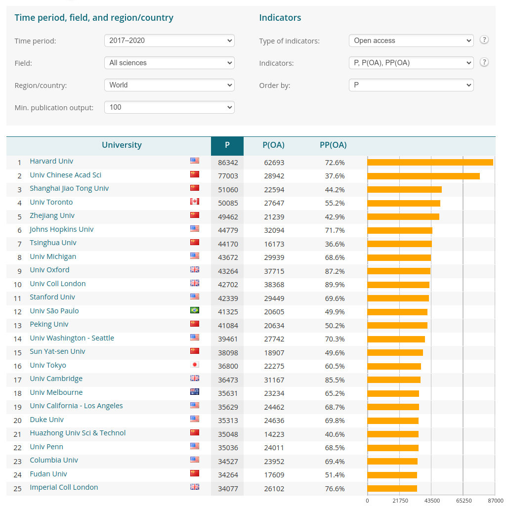
The CWTS Leiden Ranking21 is a dashboard developed by the Centre for Science and Technology Studies (CWTS) at Leiden University, which ranks 1,318 universities globally. This dashboard offers information on scientific impact, collaboration, open access, and author gender, but in this review, we focus solely on the open access information that has been part of the dashboard since 2019. The ranking is generated from the Web of Science dataset and refined by CWTS through author disambiguation, precise publication-to-university matching, and integration of open access data from Unpaywall. Rankings are released yearly and are based on material from up to two years prior to the ranking release date. The global ranking section of the dashboard includes a list, chart, and map view. In the list view (Figure 5), users can view universities ranked by total number of publications, with the total and percentage of open access publications as additional columns. The universities can be sorted by the open access columns. Users can filter universities by region, country, and minimum number of publications and modify aggregated statistics based on time period and field of research. The individual institution pages provide more detailed open access statistics, including a tabular breakdown of open access categories, a bar chart of open access (Gold, Hybrid, Bronze, and Green OA) by subject area, and a time series chart of open access (OA, Gold, Hybrid, Bronze, Green, and unknown) by subject area. Users have the option to switch between viewing total publications or percentages in the chart representations.
2.3.6 Google Scholar Public Access
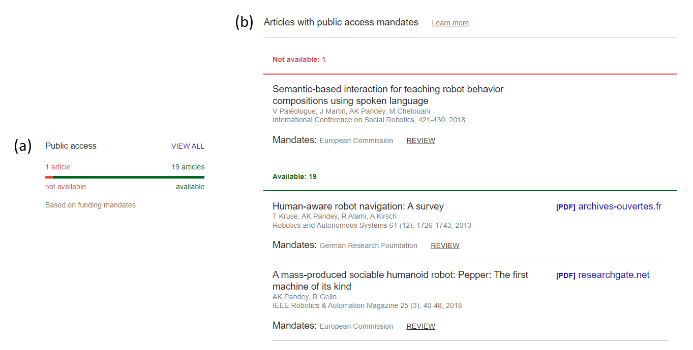
In early 2021, Google Scholar introduced a feature that allows authors to monitor their compliance with public access mandates from funders (Sethi et al. 2021). The author profile pages display the number of articles that have a public access mandate from a funder and the number that are publicly accessible (Figure 6a). Users can also delve deeper into an individual author profile to see a list of which articles are publicly accessible and which ones are not (Figure 6b).
2.3.7 Lens.org
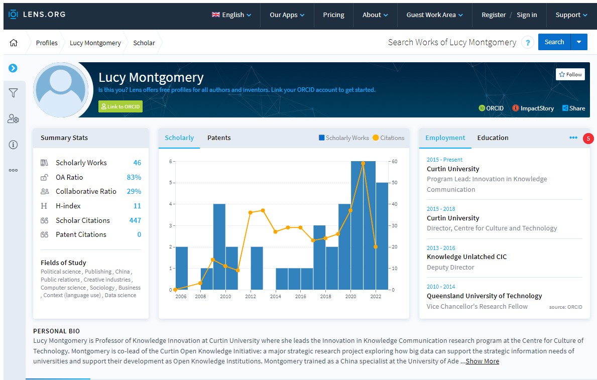
Lens.org is a search engine with the purpose of locating scholarly works, patents, and academic authors (Figure 7). The author search function offers users the ability to locate and access profiles of academic authors, which presents a summary of the proportion of their published works that are open access (OA Ratio). Additionally, the author profile page includes a list of the authors’ scholarly works, indicating which of these works are open access. Lens.org provides profile pages for authors who have registered with ORCID.
2.3.8 Discussion
Open Science Monitor, French Open Science Monitor, OpenScience Observatory, CWTS Leiden Ranking, Google Scholar Public Access, and Lens.org are free to use. OpenAIRE Monitor charges for creating organization dashboards, a small number of which are publicly accessible.
Three tools provide a ranking of open access performance, including Open Science Monitor, OpenScience Observatory, and CWTS Leiden Ranking. Only the Open Science Monitor ranks entities by the percentage of open access outputs by default. OpenScience Observatory ranks countries by name, and CWTS Leiden Ranking ranks universities by publication count (even when the open access indicator is set), with users needing to sort the results to view a ranking by an open access metric. French Open Science Monitor, OpenAIRE Monitor, Google Scholar Public Access, and Lens.org do not provide rankings of open access performance.
Open Science Monitor, French Open Science Monitor, OpenAIRE Monitor, OpenScience Observatory, and CWTS Leiden Ranking provide comprehensive open access statistics, including percentage and total numbers of open versus closed access, time series charts, and breakdowns by open access category. French Open Science Monitor, Open Science Monitor, and CWTS Leiden Ranking also provide breakdowns of open access by subject area. The French Open Science Monitor is unique because it calculates and visualizes how open access has changed across different observation time points, rather than just displaying the current open access percentage for each year of publication. Google Scholar Public Access and Lens.org provide a single open access metric, with Google Scholar showing how well authors are complying with public access mandates from funders and Lens.org showing the percentage of an author’s outputs that are open access.
The dashboards collectively provide aggregated open access statistics for different types of entities, including countries, organizations, and authors. Open Science Monitor, French Open Science Monitor, and OpenScience Observatory for countries; French Open Science Monitor, OpenAIRE Monitor, and CWTS Leiden Ranking for organizations; and Google Scholar and Lens.org for authors. French Open Science Monitor, Open Science Monitor, OpenScience Observatory, and OpenAIRE Monitor cover a limited number of countries or organizations, with French Open Science Monitor covering France and thirty French institutes, Open Science Monitor and OpenScience Observatory primarily covering European countries, and OpenAIRE Monitor covering organizations that have opted to pay to have dashboards created. CWTS Leiden Ranking covers over one thousand universities worldwide. Google Scholar and Lens.org cover a large number of authors worldwide.
Most of the systems use the traditional open access categories. The exceptions are the French Open Science Monitor and the OpenScience Observatory by OpenAIRE, which both use an interpretation of the open access categories that treat Gold and Green equally by showing the intersection of Gold and Green. The French Open Science Monitor goes further by renaming Gold to “publisher,” Green to “open repositories,” and the intersection as “publisher & open repositories” and using this terminology throughout their dashboards.
Most of these tools visualize data that is updated regularly, except for Open Science Monitor, a one-off report from 2018. Open Science Monitor, OpenScience Observatory, and OpenAIRE Monitor collectively cover publications from 2007 to the present. The French Open Science Monitor and the CWTS Leiden Ranking release new versions yearly. The French Open Science Monitor covers publications from 2013 to one year before the release date, and the CWTS Leiden Ranking includes publications from 2006 to two years before the ranking release date. Google Scholar and Lens.org cover publications from the early twentieth century to present.
2.4 University Rankings
Universities, governments, and funders frequently use university rankings and bibliometric information to measure academic and institutional performance, which impacts many aspects of academia (Huang, Neylon, Brookes-Kenworthy et al. 2020).
Some of the limitations of university rankings include:
Features used to calculate rankings may not be suitable measures of university quality (Selten et al. 2020; Billaut, Bouyssou, and Vincke 2010; Huang 2012).
Changes to data sources can cause significant changes to ranking positions (Huang, Neylon, Brookes-Kenworthy et al. 2020).
Bibliometric datasets used for rankings have less coverage for non-English publications and publications from the humanities and social sciences (Montgomery et al. 2020; Aksnes and Sivertsen 2019).
Previous rankings can affect future rankings, primarily when survey data is used (Montgomery et al. 2020; Espeland and Sauder 2007).
3 Design
We designed the COKI Open Access Dashboard to address the issues described above that we experienced with the existing open access categories and the issues with existing tools that visualize open access performance information.
Our first contribution is redesigning the open access categories to make them easier to understand. The design process for the open access categories was iterative and involved brainstorming, creating low-fidelity paper prototypes (Interaction Design Foundation n.d.) and discussions among COKI team members, consisting of domain experts on open access, a user experience designer, a graphic designer, and software engineers. Our second contribution is the COKI Open Access Dashboard, which is designed to improve on existing open access visualization tools, by being specifically designed to present high-level open access performance data for the above target audiences so that they can evaluate their country’s or institution’s open access publishing performance. Our dashboard also has comprehensive coverage of countries and institutions worldwide. The high-level design requirements and target audiences for the dashboard are described below.
The high-level design requirements for the dashboard include:
The visualizations of open access statistics should be easy to understand.
The dashboard should be easy to use.
The dashboard should have an aesthetically pleasing design.
The design should be mobile first, working well on mobile and desktop.
Academic librarians: to enable academic librarians to find helpful information for talking to academics and decision makers in their institution about adopting open access.
Academic researchers: to enable researchers from universities and companies to see how well their institution performs at open access publishing so that they can advocate for change.
Public: to enable the public to see how their countries and institutions perform in terms of open access publishing.
In the rest of this section, we discuss our design decisions in more detail, including our contributions of redefining the open access categories and creating a dashboard to enable academics, librarians, and key decision makers to evaluate their country’s or institution’s open access publishing performance.
3.1 Redefining the Open Access Categories
From our previous experience designing open access dashboards, we have identified a range of issues with the open access categories; these include:
The categories are named after colors or metals, which do not convey the meaning behind the categories.
There are many categories. They include open access, Green, Gold, Hybrid, Bronze, Grey, Diamond/Platinum, and Black OA.
The category colors are inconsistent; for instance, there is a mixing of traffic light colors (orange, green) and Olympic medal colors (gold, silver, bronze), leading to questions such as is Gold OA better than Green OA or is Green OA better than Gold OA?
The concept of Gold OA open access prioritizes research outputs made available on publisher websites above publications made available through other venues.
When visualizing breakdowns of open access, users often expect the subcategory values to add up to 100%, which has often meant that we must choose between prioritizing one category over another.
Categories based on the specifics of licensing are confusing.
All the above notwithstanding, attempts to argue for a radical change in categorization have been unsuccessful.
Our focus when designing the categories and dashboard was to simplify the categorization of open access from the perspective of readers of academic works. Another important perspective on open access is the cost of publishing for authors of academic works. We have not addressed the question of author-side costs in this iteration of the design to keep the scope of the design narrow and because of scarce data on author-side costs.
3.1.1 High-Level Categories
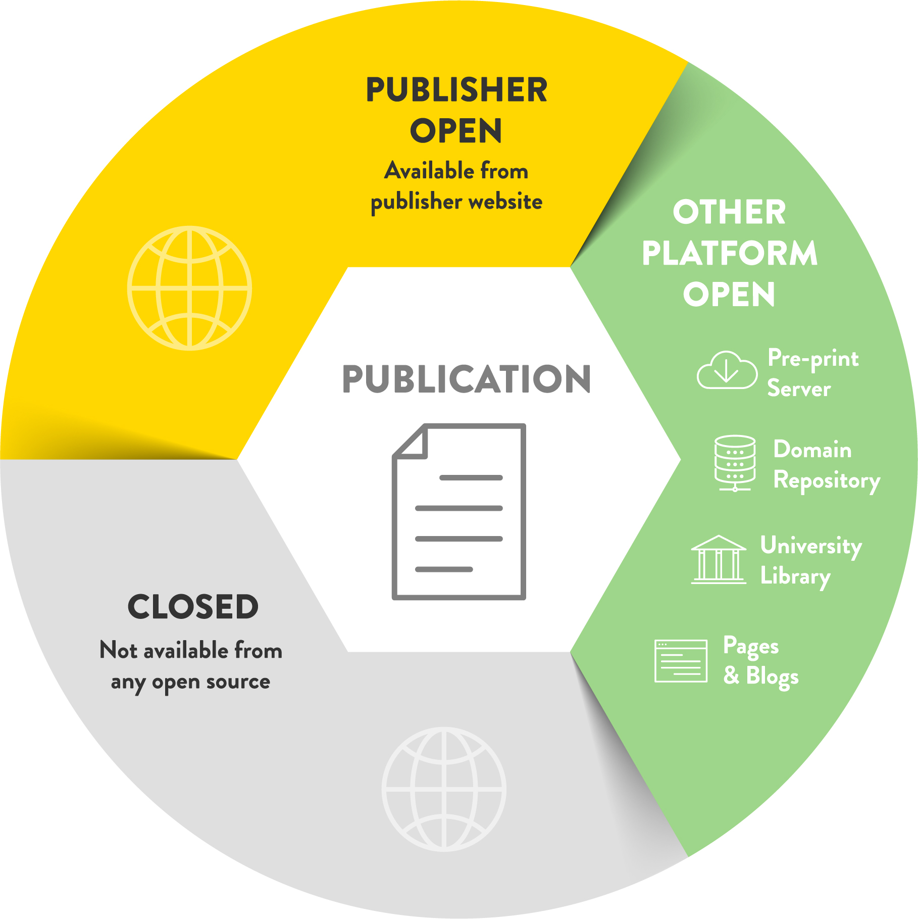
We refactored the abstraction levels used to represent open access, using a hierarchy of categories and subcategories (described later). At the top level, we define three categories, focusing on distinguishing between access via publishers and other platforms, the two broad ways a research output can be made more accessible. The high-level categories (Figure 8) include:
Publisher Open: an article published in an open access journal or made accessible in a subscription publisher.
Other Platform Open: a publication shared on a preprint server, an institutional repository, a domain repository, a public repository, or the wider internet.
Closed: a publication that is not accessible, that is, it is not assigned to either of the first two categories.
The above approach allows us to use descriptive terminology instead of opaque color names by reorganizing the existing color names into the three new categories. Publisher Open encapsulates Gold, Hybrid, and Bronze OA, and Other Platform Open25 encapsulates Green and Grey OA. The use of hierarchy helps people form a top-down, summarized understanding of complicated subjects and is often used in software development (modularity) and software engineering diagrams (Moody 2009; Flood and Carson 1993; Nordbotten and Crosby 1999). For instance, it is easier to understand the three top-level categories of Publisher Open, Other Platform Open, and Closed than the six traditional categories Gold, Green, Hybrid, Bronze, Grey OA, and Closed, which have no explicit hierarchy. This refactoring also allows us to adopt the standard colors for the new categories, so those familiar with the existing categories can broadly match the colors they know with the new ones.26 The term Gold OA is avoided due to inconsistent definitions, sometimes describing open access journals only and sometimes including the Hybrid OA category.
In addition to the use of hierarchy, we explicitly show a category of outputs accessible via both Publisher Open and Other Platform Open (Figure 9). We believe this is important to emphasize that Publisher Open and Other Platform Open operate in parallel and that one is not more important than the other. This distinction contrasts with other interpretations that privilege Gold OA over Green OA (Piwowar et al. 2018). As Piwowar and colleagues (2018, 16) argue, the intersection between Gold OA and Green OA provides a “useful safety net that preserves access in cases where publishers rescind it,” which could occur with Bronze OA articles. The other advantage of our design is that the categories add up to 100%, addressing a common user expectation and making it feasible to create stacked area or bar charts (Figure 9).
Table 1 describes the finer details of the high-level open access categories, including their significance and the mapping to the existing open access categories.
High-level open access categories
Category |
Description |
Significance |
Mapping |
|---|---|---|---|
Publisher Open |
An article published in an open access journal or made accessible in a subscription publisher. |
The final edited publication can be read directly from the publisher’s website. |
The sum of Gold, Hybrid, and Bronze OA |
Other Platform Open |
A publication shared online: on a preprint server, an institutional repository, a domain repository, a public repository, an academic staff page, or an academic social network. |
Making articles Other Platform Open is free and may be done for historic and new articles. |
The sum of Green and Grey OA |
Closed |
A publication that is not either Publisher Open or Other Platform Open. |
To increase access to academic research, the focus should be on making these publications accessible by uploading copies to repositories. |
Not open; closed or closed access |
3.1.2 Publisher Open Subcategories
After creating the high-level open access categories, we designed informative subcategories within Publisher Open and Other Platform Open.
We divide Publisher Open into the following subcategories:
Open Access Journal: an article published in an open access journal.
Hybrid: an article accessible at a subscription publisher with an open license.
No Guarantees: an article accessible at a subscription publisher with no reuse rights.
Table 2 describes the finer details of the Publisher Open subcategories, including their significance and the mapping to existing open access categories.
Publisher Open subcategories
Category |
Description |
Significance |
Mapping |
|---|---|---|---|
Open Access Journal |
An article published in an open access journal. |
To qualify as an open access journal there must be clear reuse rights and the journal must be eligible for the DOAJ. |
Interpretations of Gold OA that do not include Hybrid OA |
Hybrid |
An article accessible at a subscription publisher with an open license, e.g., a Creative Commons license. |
A route to making articles available in subscription journals that are not fully open access. It almost always involves payment of an APC or some form of institutional payment through a “read and publish” agreement. |
Hybrid OA |
No Guarantees |
An article accessible at a subscription journal with no reuse rights. |
Publishers sometimes make articles available for limited periods or make them accessible after an embargo period, but without an open license. No Guarantees makes more articles readable but does not ensure long-term accessibility; for instance, the reader has no rights to upload the article to a repository. |
Bronze OA |
The goal of having mutually exclusive categories was one reason for not including a category relating to charges (APCs). “Diamond” or “Platinum” is usually, but not always, described as a subset of open access journals. In part this is because it is possible to identify open access journals in the DOAJ that do not charge APCs. Detecting articles in hybrid journals for which APCs were not paid is more challenging. Alongside this there are many free-to-read journals that are not in the DOAJ, and many of these do not charge APCs. This combination of complexity and the completeness of data led us to not include author-side costs as a category in the current version of the dashboard. We welcome community commentary on how best to include this kind of information to improve the usefulness for authors and those working to drive adoption of low-cost publishing options.
3.1.3 Other Platform Open Subcategories
We divide Other Platform Open into the following informative subcategories:
Institution: publications placed in institutional repositories, including those shared among multiple institutions.
Preprint: publications deposited on servers that do not make claims about formal peer review.
Domain: publications from domain repositories, also known as disciplinary or subject repositories.
Public: publications from repositories that researchers from any domain can use and deposit any form of output, including preprints, published manuscripts, and datasets.
Other Internet: publications deposited on the wider internet, including publications on academic staff pages, blogs, and ASNs such as Academia.edu and ResearchGate.
We have renamed “Grey OA” to “Other Internet,” which includes articles from academic staff pages, academic social networks, and the wider internet. Other Internet is included as a subcategory to be consistent with Publisher Open, including No Guarantees; just as a publisher can remove No Guarantees articles with no warning, Other Internet articles can also disappear with no warning. For instance, publishers sometimes perform large takedowns of infringing articles from ASNs (Piwowar et al. 2018). We do not directly track outputs from academic staff pages; however, we use Unpaywall, which indexes CiteSeerX, which in turn indexes academic staff pages. We also do not currently track data from ASNs.
Table 3 describes the finer details of the Other Platform Open subcategories, including their significance.
Other Platform Open subcategories
Category |
Description |
Significance |
|---|---|---|
Institution |
Publications placed in institutional repositories, which are archives for storing and distributing an institution’s research outputs; includes repositories shared among multiple institutions. |
Institutions can take responsibility for archiving their research, ensure awareness of their research outputs, and leverage institutional policies, including rights retention approaches. |
Preprint |
Publications deposited on servers that do not make claims about formal peer review; generally non–peer reviewed manuscripts, including working papers on arXiv, bioRxiv, SSRN, RePEc. |
In many disciplines, preprints or working papers are a significant mode of dissemination. Using preprint servers also enables post-release peer review and often offers an alternate route to increasing access, which is easier than formally published versions. |
Domain |
Publications from domain repositories, also known as disciplinary or subject repositories. A domain repository contains publications from a specific subject area. Examples include PubMed Central, Europe PMC, and EconStor. |
The large domain repositories with roots in biomedical sciences, PubMed Central and Europe PMC are significant drivers of access, often linked to their use within the policy requirements for funders that were early movers on open access. |
Public |
Publications from repositories that researchers from any domain can use and deposit any form of output, including preprints, published manuscripts, and datasets. Semantic Scholar, Figshare, and Zenodo are a few examples. |
Free and public repositories are an increasing medium for releasing research materials, including those beyond the traditional research paper. Where they are explicitly used for providing access to formally published (or intended to be published) materials, they can be used to host both pre–peer review manuscripts (“preprints”) and post–peer review manuscripts. |
Other Internet |
Publications deposited on the wider internet, including publications on academic staff pages, blogs, and ASNs such as Academia.edu and ResearchGate. We do not directly track outputs from academic staff pages; however, we use Unpaywall, which indexes CiteSeerX, which in turn indexes academic staff pages. We do not currently track data from ASNs. |
It is still common to find outputs in many places. These sources are generally not archived or reliable for the long term, so we do not count them in the more reliable platform categories. |
3.2 Country and Institution Tables
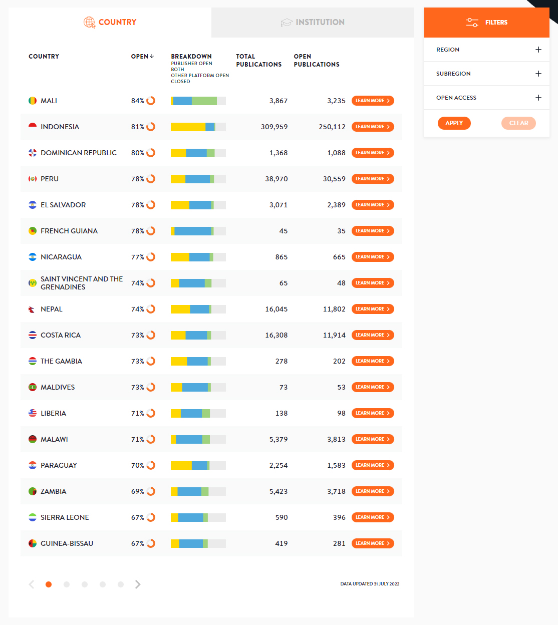
The dashboard home page on the COKI Open Access Dashboard contains country and institution tables separated by tabs (Figure 10). The table design allows users to see and compare many countries or institutions simultaneously, known as juxtaposability (Green and Petre 1996).
The information displayed in table rows often use dual coding, combining text and pictures to convey information more effectively (Moody 2009). The flag, country name, logo, and institution name enable easy identification of each country and institution. The textual percentage and small doughnut chart provide a dual-coded view of the open access percentage, the most important metric on our dashboard.
The breakdown sparkline bar charts provide a glance view of the high-level open access categories within the index table. The total number of publications and the number of open publications are valuable information for interpreting the results in context and for feedback when filtering. The Learn More buttons provide an explicit cue that it is possible to navigate to details pages, as users are sometimes unaware that table rows are clickable. Lastly, most columns are sortable to enable exploration in multiple dimensions.
Considering the limitations of rankings discussed in Section 2.4, we made two design decisions in the index tables to de-emphasize the ranking concept. The first design decision is to not assign a definitive numerical ranking to countries and institutions, as users should not be concerned with their exact rank in the dashboard. For instance, the exact place of a country or institution in the dashboard could change depending on the data sources we use. The second design decision is to not enable sorting of the index tables by citation count, as the dashboard’s purpose is not to create an academic performance index.
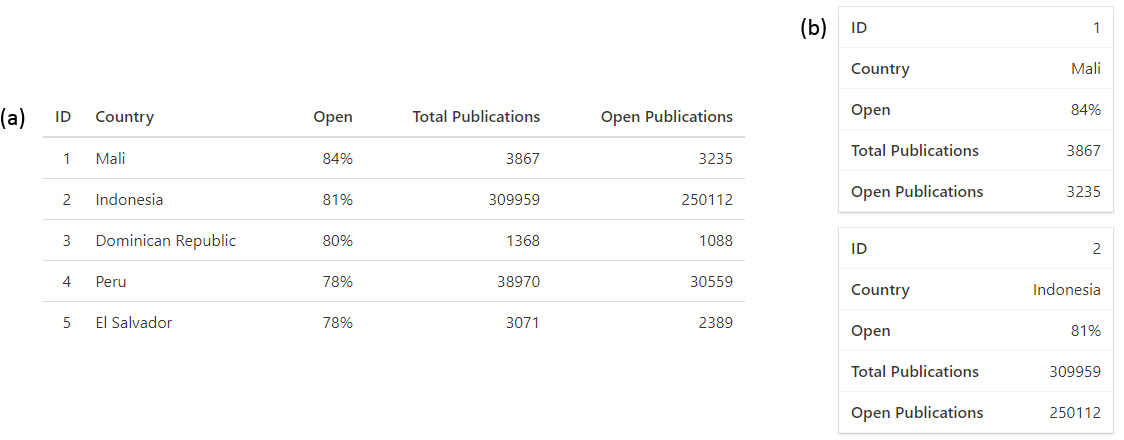
A typical pattern when visualizing tables in mobile format is to convert each table row into a card and to collapse the columns for the given row into multiple rows within the card (Hoober 2020), as illustrated in Figure 11. This pattern reduces the juxtaposability and the visibility of information in table rows, making it difficult for users to skim, view quickly, and compare data throughout the table (Hoober 2020).
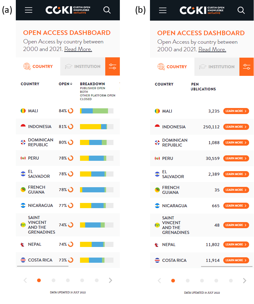
In contrast to the mobile table pattern discussed above, our tables maintain juxtaposability and visibility (Green and Petre 1996) when displayed on mobile screens, as illustrated in Figure 12. This design decision ensures that the essential information is always visible: the country/institution column, the open access percentage, and the open access breakdown. Users can scroll vertically to see more rows and horizontally to see more columns. The country/institution column is always visible (a sticky column) so that data from other columns can always be associated with a specific country or institution.
3.3 Filters
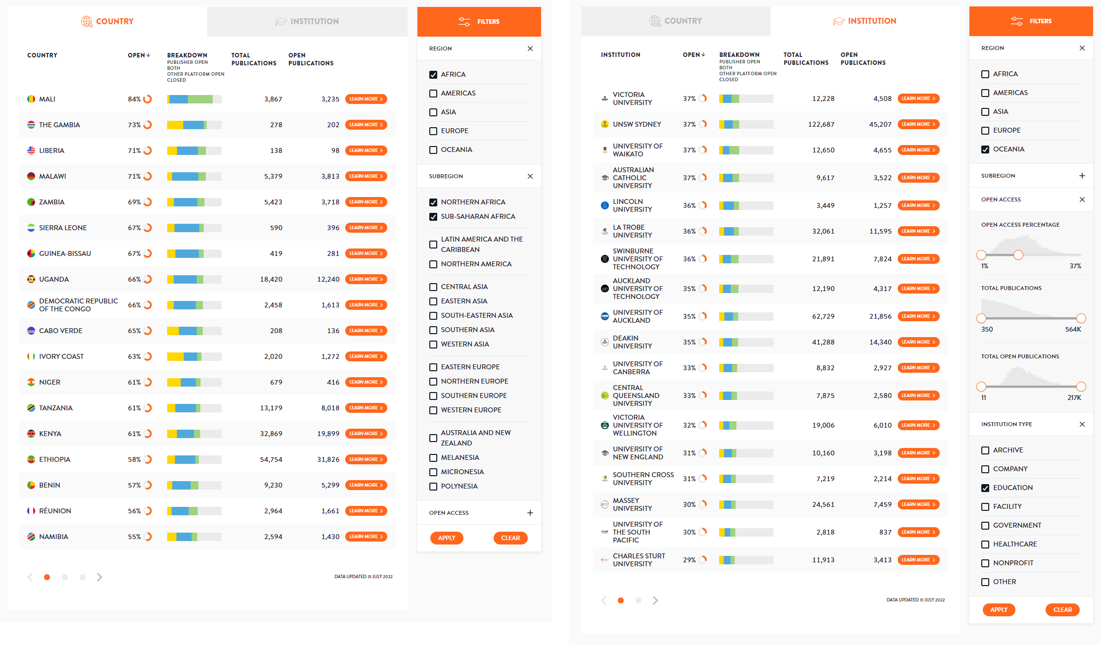
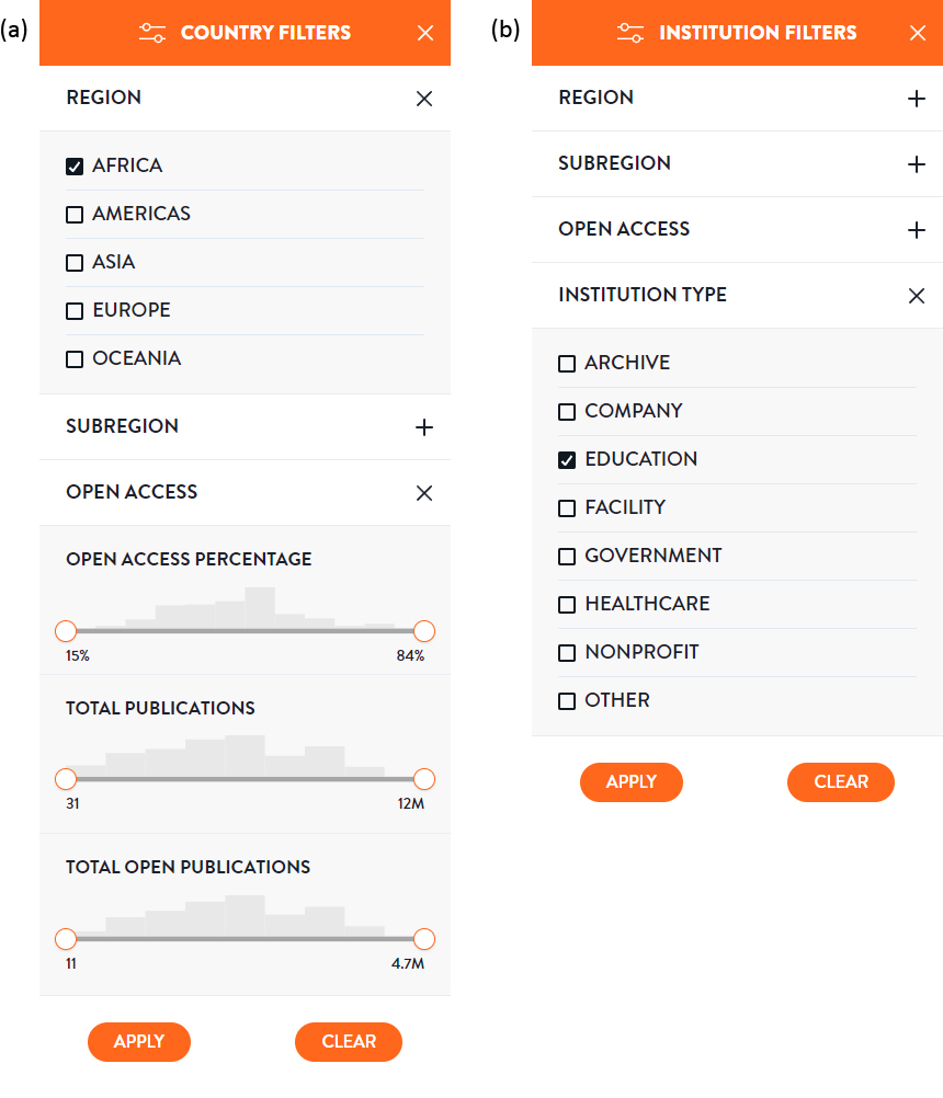
Filters are available to narrow down the items in the country and institution tables so that users can make intelligent, meaningful comparisons between countries or institutions. Figure 13 illustrates the desktop country and institution filters. Users can filter on region, subregion, open access percentage, total publications, total open publications, and institution type. The filters in the open access accordion, including open access percentage, total publications, and total open publications, each have a histogram to help users understand the distribution of items when filtering. We transform the total publications and total open publications histogram and range slider data to be more like normal distributions because it makes the range sliders easier to use.
The main difference for filters on mobile is that they appear in a modal window popup (Figure 14) after clicking the filter button in the tab header row (Figure 12). The modal window provides more space, having a trade-off of no visibility or juxtaposability of the index tables. The filter button on mobile is a part of the tab headers (Figure 12) to make it clear that filtering functionality exists.
3.4 Search
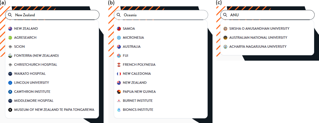
The search bar at the top right corner of the page enables users to find the details page for a specific country or institution. One may search for countries with country or region names and institutions with institution names, regions, countries, or acronyms. For instance, if one types “New Zealand,” then New Zealand and its institutions will be listed; for “Oceania,” Oceanic countries and institutions will be listed; and for “ANU,” Australian National University will appear in the search results (Figure 13).
3.5 Detail Pages
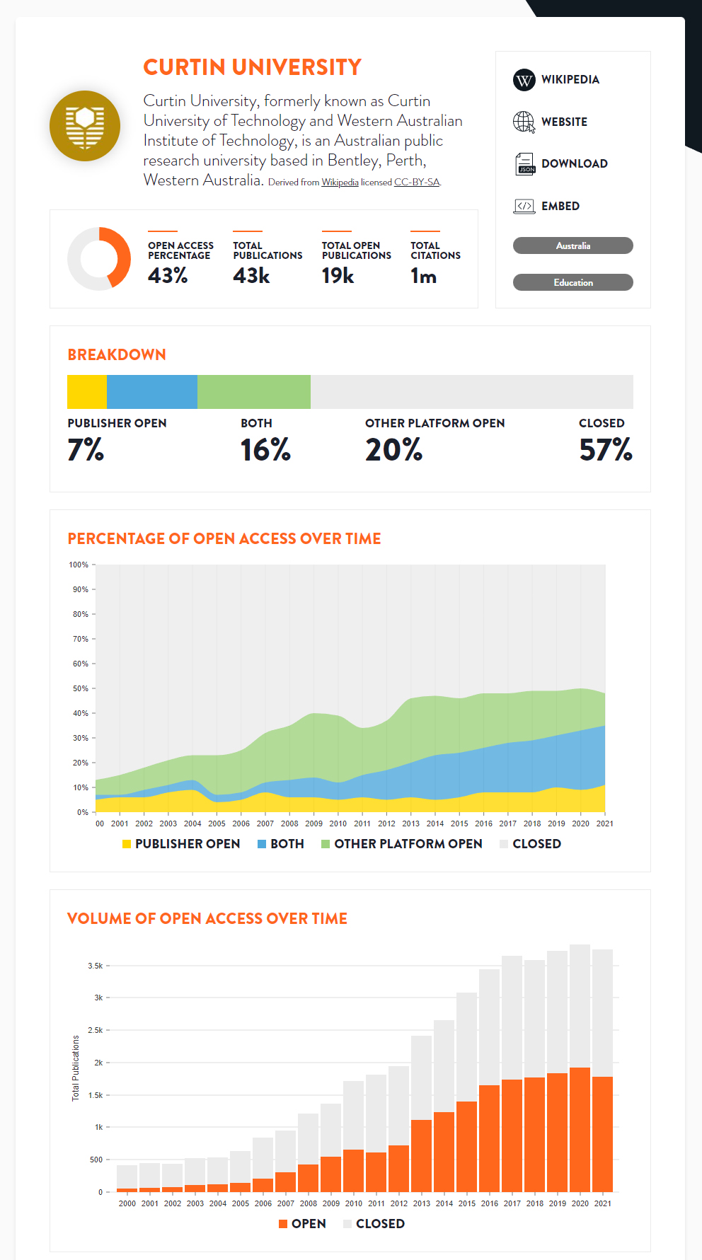
The detail pages provide comprehensive open access statistics for each country and institution (Figures 16 and 17). The broad categories of the information displayed on this page include metadata and high-level statistics about the country or institution; the breakdown, percentage, and volume of open access over time; breakdowns of the Publisher and Other Platform Open subcategories; and Other Platform locations.
There is a subtle distinction to be aware of when interpreting time series charts. The charts show how well a country or institution is currently performing at making publications from different years open access. Technically, the charts do not show how well a country or institution performed at open access publishing in years before the present time.27 However, it can be interpreted as a rough estimate of past performance because institutions typically do not focus on making historic publications open access, although they should!
For example, in the percentage of open access over time chart in Figure 16, 61% of publications from 2010 are closed access. If Curtin University made all publications from 2010 open access today, the value for 2010 would change to 100%. It does not mean that in 2010, 61% of publications were closed.
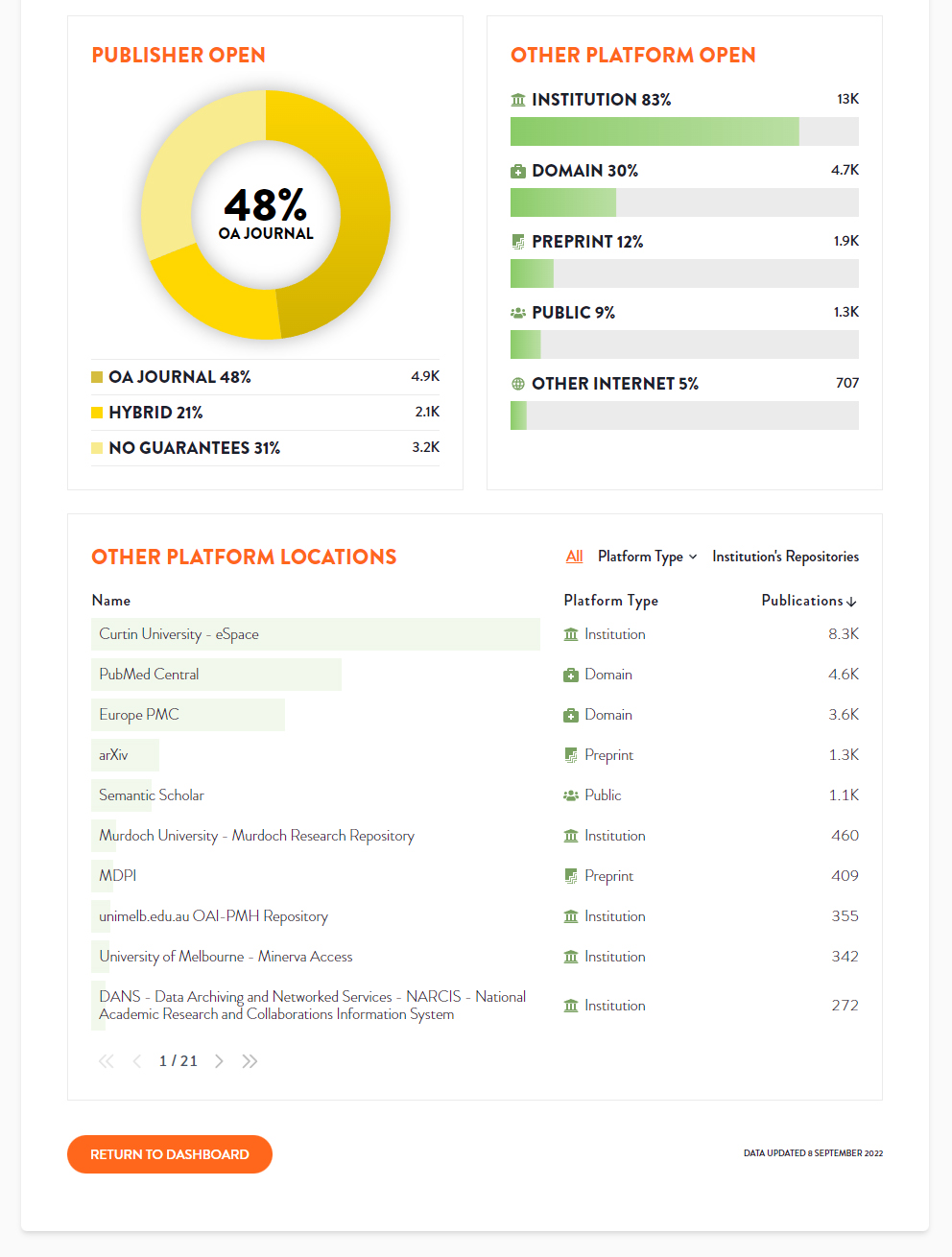
Figure 17 illustrates the Publisher Open and Other Platform Open subcategory breakdown charts. We use a doughnut chart visualization for Publisher Open to emphasize that its subcategories are parts of a whole (Tom, comment on Holtz n.d.), adding up to 100%. We use a bar plot for Other Platform Open because this is a more suitable visualization when percentages do not add up to 100% and when there are more categories to visualize (Holtz n.d.). We sort the items from highest to lowest and use icons rather than different shades of green, as this makes the bar plot easier to interpret.
The Other Platform locations table (Figure 17) shows what repositories a given country or institution uses, their platform types, and which are the most popular. The table is filterable by platform type, or it can just show the repositories belonging to the given institution.
An infrequent, persistent problem is that an institution’s repository may be inaccessible due to a login wall, or Unpaywall might not know about the repository. To address this, where we have not found any repositories for an institution and the user filters by the institution’s repositories, we show helper text to explain why this could be and a form on which they can correct the problem or seek help.
3.6 Information Pages
In addition to the dashboard, the website has several information pages providing extra information relating to the dashboard. These include:
Open Access: for people who want to learn more about open access and those who want to know about the COKI definitions of open access.
How It Works: how we create the data behind the dashboard.
Data: COKI Open Access Dataset download links and schema documentation.
4 Data
The data for the dashboard is created by fetching data about research publications from multiple sources, synthesizing the datasets and creating the open access calculations for each country and institution (Hosking et al. 2022; Diprose et al. 2023). We describe these steps below.
4.1 Fetch Datasets
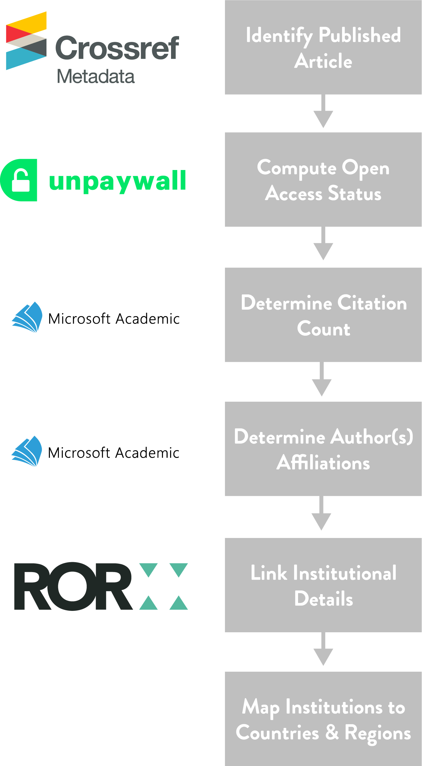
Each week we collect several specialized research publication datasets. These include Crossref Metadata,28 Unpaywall,29 Microsoft Academic Graph30 (MAG), and ROR.31 We are using the final MAG release from December 11, 2021, and we are currently moving to OpenAlex,32 as MAG is no longer maintained. The authoritative source of Crossref DOIs is provided by Crossref Metadata, open access status by Unpaywall, institutional affiliation and citation count from MAG, and organizational information from ROR (Table 4).
Datasets and their roles
Dataset |
Role |
|---|---|
Crossref Metadata |
Authoritative source of Crossref DOIs |
Unpaywall |
Open access status |
Microsoft Academic Graph |
Affiliation, citation count |
Research Organization Registry |
Institution identifiers, country codes, and other metadata |
4.2 Synthesis
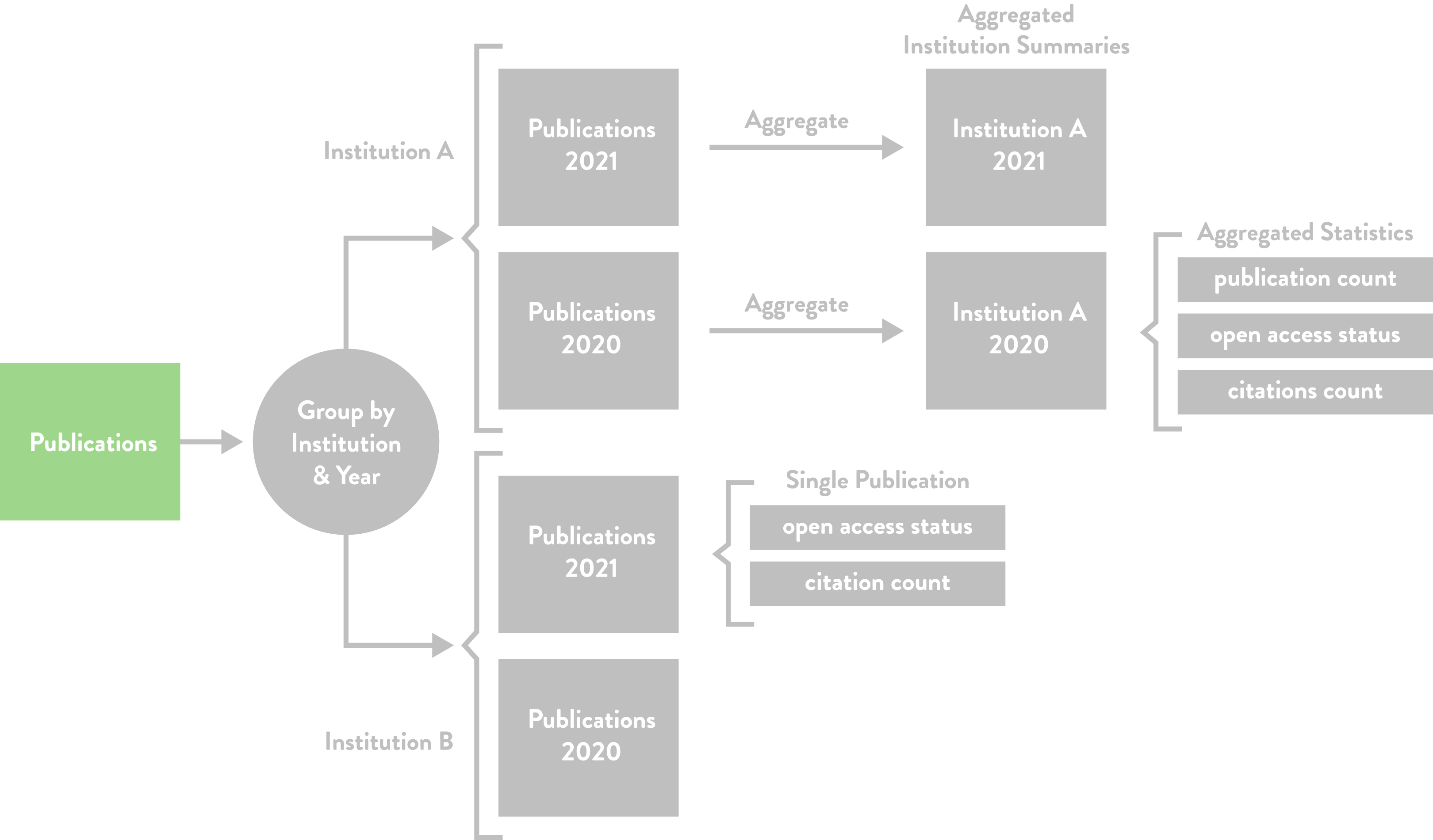
After the datasets are fetched, they are synthesized to produce aggregate time series statistics for each country and institution (entity type) in the dataset. The aggregate time series statistics include publication count, open access status, and citation count.
The synthesis occurs in three steps, as illustrated in Figure 18:
Create a table of publications.
Group the publications by entity type and year of publication.
Compute aggregated summaries for each group.
The table of publications is created by joining records from the research publication datasets on Crossref DOIs, unique digital identifiers given to most scholarly publications. Publications without a Crossref DOI, including those registered through Data Cite, CRKN, and other DOI registration agencies are currently not included. The dataset therefore has the best coverage for journal articles in English.
Using a single publication as an example, Figure 19 shows how each dataset contributes to the publications table throughout the joining process. Unique publications are identified with Crossref Metadata; each publication’s open access status is calculated from Unpaywall; and each publication’s citation count, authors, and institutional affiliations are determined with MAG. Finally, ROR is used to enrich the institutional affiliation records with institution details and map institutions to countries and regions. The ROR assignment of country codes to institutions is used.
Once the publications table is created, the publications are grouped by entity type and publication year; for instance, as shown in Figure 20, publications are grouped by institution and publication year. The last step involves creating aggregate time series statistics based on the yearly groups of publications.
4.3 Open Access Calculations
The Unpaywall dataset is used to determine open access status, including Publisher Open, Other Platform Open, and Closed Access, with the corresponding calculations outlined in Table 5. Furthermore, the calculations for the subcategories of Publisher Open and Other Platform Open are described in Table 6 and Table 7, respectively
Open access status calculations
Category |
Description |
Unpaywall Query Details |
|---|---|---|
Publisher Open |
An article published in an open access journal or made accessible in a subscription journal. |
Where the Unpaywall journal_is_in_doaj field is True or where the Unpaywall best_oa_location location_type field is “publisher.” |
Other Platform Open |
A publication shared online: on a preprint server, a university library repository, a domain repository, an academic staff page, or on a website such as ResearchGate or Academic.edu. |
Any article where any oa_location element in the Unpaywall data has the location_type “repository.” |
Closed |
A publication that is neither Publisher Open nor Other Platform Open. |
Where journal_is_in_doaj is False and best_oa_location is null. |
Publisher Open subcategory calculations
Category |
Description |
Unpaywall Query Details |
|---|---|---|
Open Access Journal |
An article published in an open access journal. |
We use the journal_is_in_doaj tag from Unpaywall to define this category, which requires that there be some licensing information provided. |
Hybrid |
An article accessible at a subscription journal with an open license, e.g., a Creative Commons license. |
We check that the license field for the best_oa_location is not null and journal_is_in_doaj is False. This includes the value of “implied_oa,” which covers cases where publishers have a general assertion of a license, but it is not clear from the page. |
No Guarantees |
An article accessible at a subscription journal with no reuse rights. |
All cases where the best_oa_location is “publisher,” the license field is null, and journal_is_in_doaj is False. |
Other Platform Open subcategory calculations
Category |
Description |
Query Details |
|---|---|---|
Institution |
Publications placed in institutional repositories, which are archives for storing and distributing an institution’s research outputs. Includes repositories shared among multiple institutions. |
Where we have manually matched a repository to an institution, or where oa_locations.repository_institution matches a ROR ID with the ROR affiliation matcher, or where the domain from the pmh_id field matches a link from a ROR record. |
Preprint |
Publications deposited on servers that do not make claims about formal peer review. Generally non–peer reviewed manuscripts, including working papers on arXiv, bioRxiv, SSRN, RePEc. |
Where we have manually classified a repository as a preprint server. |
Domain |
Publications from domain repositories, also known as disciplinary or subject repositories. A domain repository contains publications from a specific subject area. Examples include PubMed Central, Europe PMC, and EconStor. |
Where we have manually classified a repository as a domain repository. |
Public |
Publications from repositories that researchers from any domain can use and deposit any form of output, including preprints, published manuscripts, and datasets. Semantic Scholar, Figshare, and Zenodo are a few examples. |
Where we have manually classified a repository as a public repository. |
Other Internet |
Outputs on sites we have not classified. In practice, these are copies identified by CiteSeerX, which Unpaywall indexes. It may include publications on academic staff pages, blogs, and social networks. We do not directly track outputs on platforms such as Academia.edu and ResearchGate. |
Outputs found on CiteSeerX, which often point to academic staff pages and blogs. We do not currently track outputs from ASNs. It also includes outputs from repositories that we have not yet classified. |
5 Web Application Architecture
The dashboard uses a static site generation architecture,33 whereby a program generates all the dashboard’s web pages ahead of time and then stores and delivers the fully rendered pages with a content delivery network (CDN). Once the user has loaded the web page in their browser, it transforms into a single-page web application with dynamic client-side navigation and rendering.
We chose a static site generation architecture for the following reasons:
Pages are quick to display in the user’s browser.
It provides a dynamic user experience.
Users can find countries and institutions via search engines.
It is inexpensive to run and easy to maintain.
It can scale to many users.
Second, users have the same dynamic user experience as a single-page application. After the initial page is loaded, the web application transforms into a single-page web application with client-side navigation.34
Third, the country and institution pages can be discovered via search engines such as Google and Bing because all the pages are prerendered as HTML and are easy for search engines to parse. Additionally, unlike many client-rendered applications, the website can be archived and viewed on the Internet Archive, keeping a record for the future.
Fourth, the system is inexpensive to run and easy to maintain because it consists of a CDN, storage, and serverless functions.
Fifth, the system can scale well to many users because there is no bottleneck from a web server or database and a CDN serves the content.
The rest of this section describes the architecture and implementation in more detail, including the web application, the build and deployment architecture, and the serving architecture.
5.1 Web Application
Next.js35 is used to build the web application, a React36 framework for creating static rendered websites. We chose React because it is the most popular web front-end framework and Next.js because it is the most popular and feature-rich React-based static site generation framework.
Chakra UI37 is used to create the user interface because it supports Next.js, enables extensive theming and customization of user interface components to implement the graphic design, and supports server-side rendering of its components.
We use React Table,38 a headless React table library, to create the dashboard tables because it supports server-side rendering, and we can skin the tables with any user interface framework. Lastly, we use both Nivo39 and D3.js40 to create charts as they both support server-side rendering. We use Nivo where possible because it has a higher-level interface and supports React. We use D3.js for more complex or custom use cases, such as the range slider histograms.
5.2 Build & Deploy
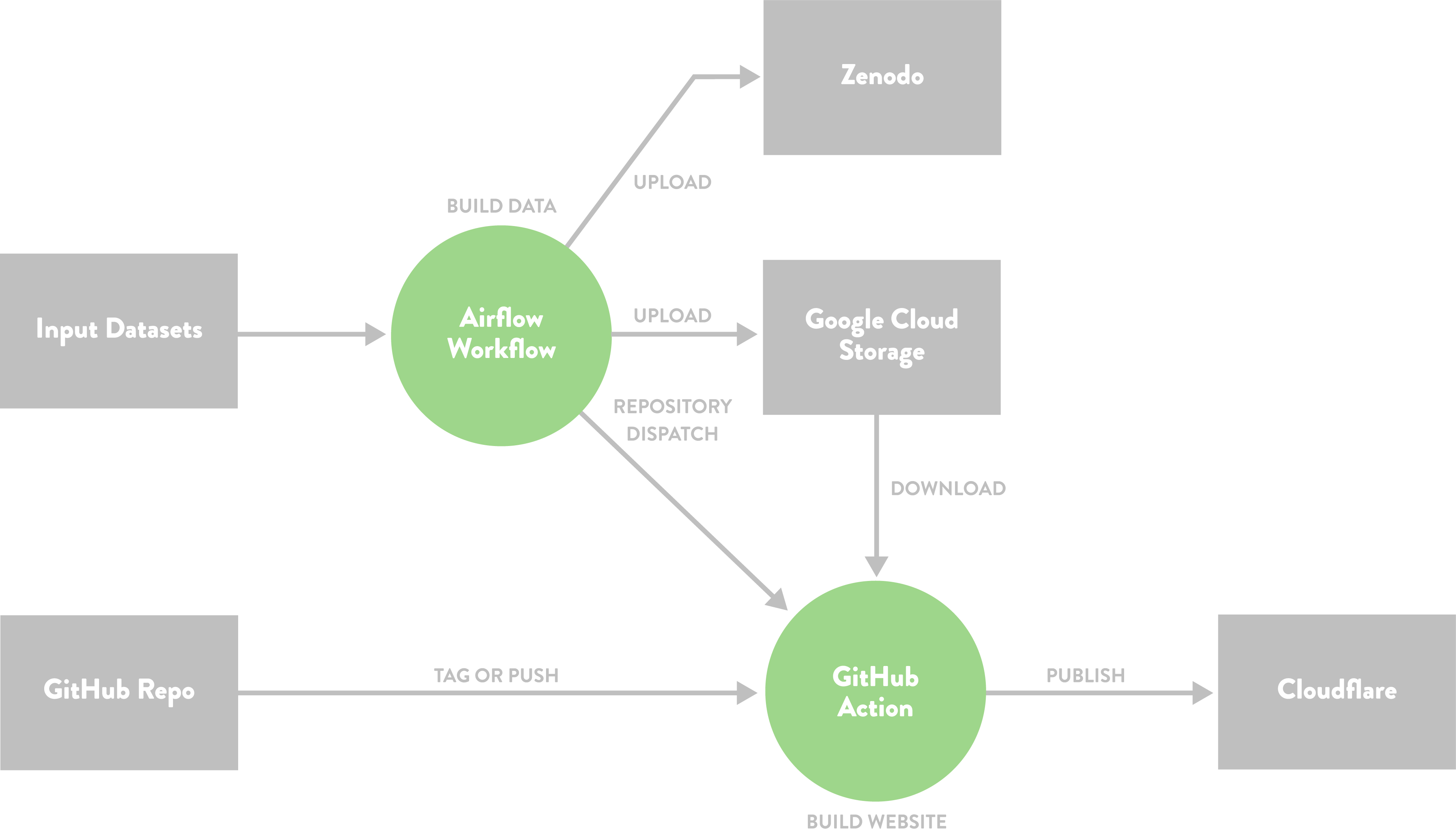
Figure 21 illustrates the system for generating data and deploying the dashboard. An Apache Airflow41 workflow fetches data, computes metrics, and transforms the data into a suitable format for building the dashboard and uploading to Zenodo.42 When the Airflow workflow finishes, it sends an event to GitHub Actions,43 which runs another workflow responsible for building and publishing the dashboard website to the hosting provider.
5.3 Serve
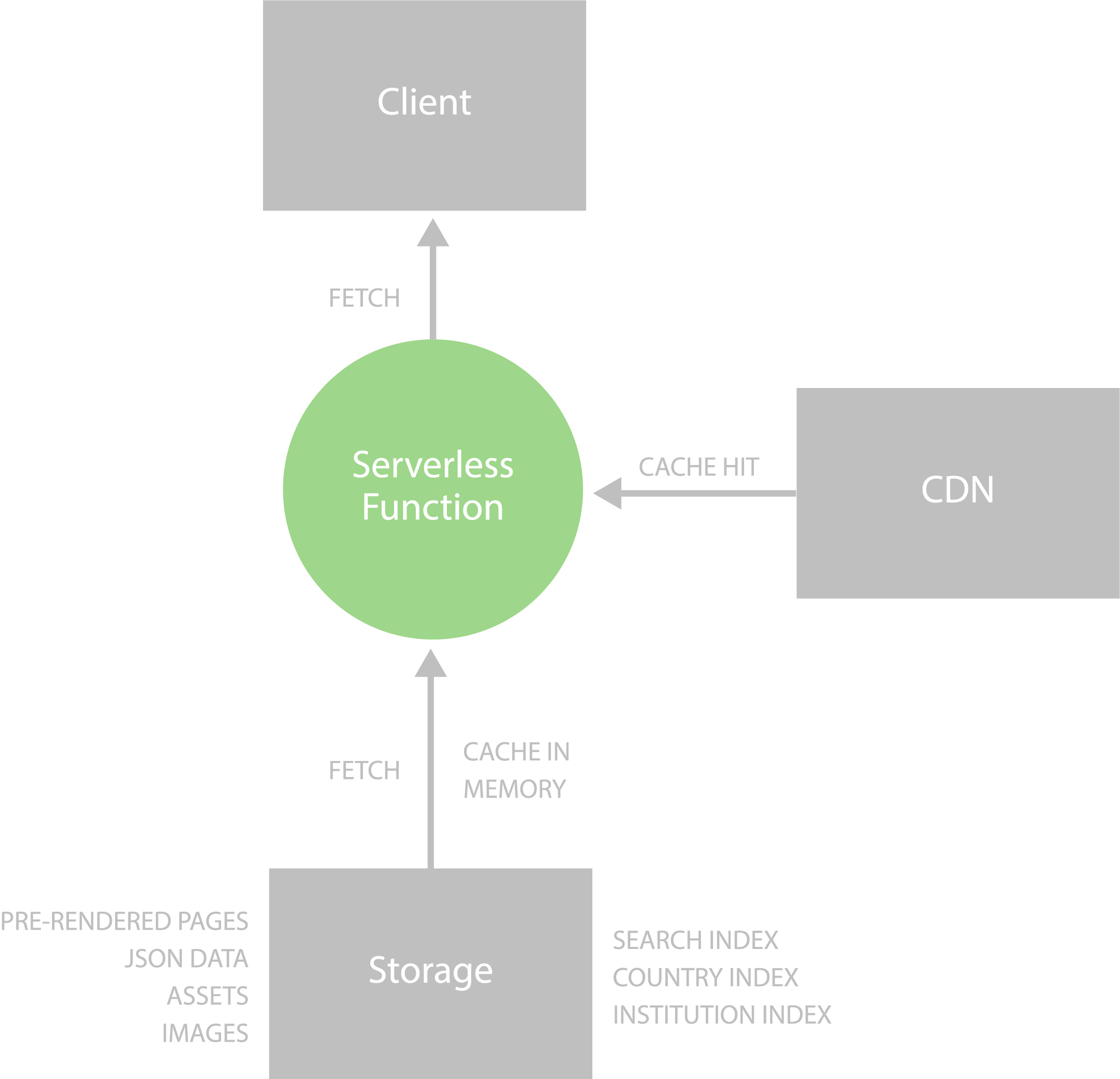
We serve the dashboard with Cloudflare,44 using Cloudflare Workers Sites45 to run the static web application. Serving static content is fast, low cost, and requires less maintenance because a server and database are not needed. Figure 22 illustrates this architecture.
A Cloudflare Workers46 serverless function runs the REST API that powers the dashboard’s full-text search and filtering interfaces. These interfaces query dynamic data via the REST API, which stores search indexes in the Cloudflare Workers’ memory so that a database is not needed, allowing better scaling, greater speed, and less maintenance over directly querying a database. The full-text search uses FlexSearch,47 a fast full-text search JavaScript library.
The static web application content and the REST API responses are cached on a CDN across multiple geographical locations to improve user access times further.
6 Conclusion and Future Work
The COKI Open Access Dashboard resolves common user experience issues with the existing open access categories and tools that visualize open access statistics for countries and institutions. We have renamed and reconfigured the open access categories to provide more meaningful nomenclature and moved away from the opaque names based on colors. To improve existing open access dashboards, we have made our dashboard free and open source and provided comprehensive open access statistics for hundreds of countries and over seven thousand institutions worldwide. In the spirit of open infrastructure, we have described the design choices that led to our changes to the open access categories, the dashboard, the data transformations, and the architectural framework of our web application for the benefit of the community and future maintainers.
For future work on the dashboard we plan to:
Add more countries and institutions.
When filtering, update the URL in the address bar to enable users to share filtered views of the dashboard and to fix backward browser navigation.
Enable the embedding of a country or institution summary in a web page.
Enable downloading of a comma-separated values (CSV) file with data for a specific country or institution.
Add more filters, such as the ability to filter institutions by country.
Make a variety of usability and workflow improvements.
Benchmark and enhance accuracy of country and institution affiliation matching, including multilingual affiliation strings.
Update our dataset and dashboard to capture change in open access across time, rather than only capturing the current state of open access publishing performance.
Consider how to support a wider range of perspectives and information, for instance by including information on author-side costs in the dashboard and datasets. We focused on the perspective of readers of academic works rather than authors, which means that we have not included categories that relate to author-side costs in this version of the dashboard.
Acknowledgements
The authors would like to thank the Research Office at Curtin, the Faculty of Humanities, School of Media, Creative Arts and Social Inquiry and the Curtin Institute for Computation at Curtin University, the Mellon Foundation and Arcadia, a charitable fund of Lisbet Rausing and Peter Baldwin, for their support in making this work possible. We would like to express our appreciation to Janette Diprose and Dr. William Diprose for their thoughtful review and feedback on an early draft of this manuscript. Additionally, we thank the reviewer for their insightful comments and feedback during the peer review process.
Notes
- https://open.coki.ac ⮭
- https://www.crossref.org/documentation/metadata-plus/ ⮭
- https://unpaywall.org/products/data-feed ⮭
- https://www.microsoft.com/en-us/research/project/microsoft-academic-graph/ ⮭
- https://ror.org ⮭
- https://openknowledge.community ⮭
- For instance, “publish and read agreements,” “read and publish agreements,” “transformative [sic] journals,” and “subscribe to open.” ⮭
- “Subscribe to open” describes a subscription journal that is converted to open access if it has enough subscribers. ⮭
- In 2014, Ridgway tweeted the idea of “bronze” open access (Costello 2019; Ridgway 2014). ⮭
- Presumably Marie Farge is also talking about herself when she refers to the mathematicians from The Cost of Knowledge. ⮭
- As far as we are aware, the popular ASNs do not provide DOI dumps of the outputs they cover. ⮭
- https://sci-hub.se/database ⮭
- https://www.libgen.is/dbdumps/ ⮭
- https://research-and-innovation.ec.europa.eu/strategy/strategy-2020-2024/our-digital-future/open-science/open-science-monitor/trends-open-access-publications_en ⮭
- https://research-and-innovation.ec.europa.eu/strategy/strategy-2020-2024/our-digital-future/open-science/open-science-monitor/trends-open-access-publications_en ⮭
- https://frenchopensciencemonitor.esr.gouv.fr ⮭
- https://monitor.openaire.eu ⮭
- https://graph.openaire.eu ⮭
- https://monitor.openaire.eu/dashboard/ec ⮭
- https://osobservatory.openaire.eu ⮭
- https://www.leidenranking.com ⮭
- https://www.leidenranking.com/ranking/2022/list ⮭
- https://scholar.googleblog.com/2021/03/track-and-manage-your-public-access.html ⮭
- https://lens.org/lens/profiles ⮭
- We originally used “Author Open” before “Other Platform Open”; however, as noted in Section 2.2, which discusses the open access categories, Green OA has become much broader than author self-archiving, also encompassing publisher-mediated archiving for instance. ⮭
- While the category colors are not ideal, because the color gold has connotations of being better than green, there is a trade-off between choosing colors with appropriate metaphors and making it easy for those familiar with the existing categories to match the colors they know with the new category names. ⮭
- Unfortunately, this is a limitation of the datasets and the process we use; we hope to address this in the future, as it is important to calculate open access publishing improvement. ⮭
- https://www.crossref.org/documentation/metadata-plus/ ⮭
- https://unpaywall.org/products/data-feed ⮭
- https://www.microsoft.com/en-us/research/project/microsoft-academic-graph/ ⮭
- https://ror.org ⮭
- https://openalex.org ⮭
- Also called a Jamstack architecture: https://jamstack.org. ⮭
- This is called “hydration.” ⮭
- https://nextjs.org ⮭
- https://reactjs.org ⮭
- https://chakra-ui.com ⮭
- https://react-table-v7.tanstack.com ⮭
- https://nivo.rocks ⮭
- https://d3js.org ⮭
- https://airflow.apache.org ⮭
- https://zenodo.org ⮭
- https://github.com/features/actions ⮭
- https://www.cloudflare.com ⮭
- https://developers.cloudflare.com/workers/platform/sites/ ⮭
- https://workers.cloudflare.com ⮭
- https://github.com/nextapps-de/flexsearch ⮭
- https://openalex.org ⮭
References
Aksnes, Dag W., and Gunnar Sivertsen. 2019. “A Criteria-Based Assessment of the Coverage of Scopus and Web of Science.” Journal of Data and Information Science 4 (1): 1–21. https://doi.org/10.2478/jdis-2019-0001.https://doi.org/10.2478/jdis-2019-0001
Archambault, Éric, Grégoire Côté, Brooke Struck, and Matthieu Voorons. 2016. “Research Impact of Paywalled versus Open Access Papers.” Copyright, Fair Use, Scholarly Communication, Etc., August 2, 2016. https://digitalcommons.unl.edu/scholcom/29.https://digitalcommons.unl.edu/scholcom/29
Bautista-Puig, Nuria, Carmen Lopez-Illescas, Felix de Moya-Anegon, Vicente Guerrero-Bote, and Henk F. Moed. 2020. “Do Journals Flipping to Gold Open Access Show an OA Citation or Publication Advantage?” Scientometrics 124 (3): 2551–75. https://doi.org/10.1007/s11192-020-03546-x.https://doi.org/10.1007/s11192-020-03546-x
Billaut, Jean-Charles, Denis Bouyssou, and Philippe Vincke. 2010. “Should You Believe in the Shanghai Ranking?” Scientometrics 84 (1): 237–63. https://doi.org/10.1007/s11192-009-0115-x.https://doi.org/10.1007/s11192-009-0115-x
Björk, Bo-Christer. 2016. “The Open Access Movement at a Crossroad: Are the Big Publishers and Academic Social Media Taking Over?” Learned Publishing 29 (2): 131–34. https://doi.org/10.1002/leap.1021.https://doi.org/10.1002/leap.1021
Björk, Bo-Christer. 2017. “Gold, Green, and Black Open Access.” Learned Publishing 30 (2): 173–75. https://doi.org/10.1002/leap.1096.https://doi.org/10.1002/leap.1096
Björk, Bo-Christer, Mikael Laakso, Patrik Welling, and Patrik Paetau. 2014. “Anatomy of Green Open Access: Journal of the American Society for Information Science and Technology.” Journal of the Association for Information Science and Technology 65 (2): 237–50. https://doi.org/10.1002/asi.22963.https://doi.org/10.1002/asi.22963
Borrego, Ángel. 2016. “Measuring Compliance with a Spanish Government Open Access Mandate.” Journal of the Association for Information Science and Technology 67 (4): 757–64. https://doi.org/10.1002/asi.23422.https://doi.org/10.1002/asi.23422
Boyes, Philip, and Danny Kingsley. 2016. “Hybrid Open Access—an Analysis.” Unlocking Research (blog), October 24, 2016. https://unlockingresearch-blog.lib.cam.ac.uk/?p=969.https://unlockingresearch-blog.lib.cam.ac.uk/?p=969
Bracco, Laetitia, Anne L’Hôte, Eric Jeangirard, and Didier Torny. 2022. “Extending the Open Monitoring of Open Science.” https://hal.science/hal-03651518.https://hal.science/hal-03651518
Costello, Eamon. 2019. “Bronze, Free, or Fourrée: An Open Access Commentary.” Science Editing 6 (1): 69–72. https://doi.org/10.6087/kcse.157.https://doi.org/10.6087/kcse.157
Diprose, James P., Richard Hosking, Richard Rigoni, Aniek Roelofs, Kathryn R. Napier, Tuan-Yow Chien, Katie S. Wilson, Lucy Montgomery, and Cameron Neylon. 2023. “COKI Open Access Website.” Zenodo, January 26, 2023. https://doi.org/10.5281/zenodo.7574575.https://doi.org/10.5281/zenodo.7574575
Elbakyan, Alexandra, and John Bohannon. 2017. “Who’s Downloading Pirated Papers? Everyone.” Dryad. https://doi.org/10.5061/DRYAD.Q447C.https://doi.org/10.5061/DRYAD.Q447C
Espeland, Wendy Nelson, and Michael Sauder. 2007. “Rankings and Reactivity: How Public Measures Recreate Social Worlds.” American Journal of Sociology 113 (1): 1–40. https://doi.org/10.1086/517897.https://doi.org/10.1086/517897
Farge, Marie. 2012. “May 12, 2012 Marie Farge e-Mail to Tim Gower.” May 17, 2012. https://policycommons.net/artifacts/2295263/2012_05_17_mail_marie_farge_to_tim_gowers/3055551/.https://policycommons.net/artifacts/2295263/2012_05_17_mail_marie_farge_to_tim_gowers/3055551/
Farge, Marie. 2018. “Scholarly Publishing and Peer-Reviewing in Open Access.” In Europe’s Future: Open Innovation, Open Science, Open to the World: Reflections of the Research, Innovation and Science Policy Experts (RISE) High Level Group. European Commission.
Flood, Robert L., and Ewart R. Carson. 1993. Dealing with Complexity: An Introduction to the Theory and Application of Systems Science, 2nd ed. Springer Science & Business Media.
Gargouri, Yassine, Vincent Larivière, Yves Gingras, Les Carr, and Stevan Harnad. 2012. “Green and Gold Open Access Percentages and Growth, by Discipline.” arXiv. https://arxiv.org/abs/1206.3664.https://arxiv.org/abs/1206.3664
Green, T. R. G., and M. Petre. 1996. “Usability Analysis of Visual Programming Environments: A ‘Cognitive Dimensions’ Framework.” Journal of Visual Languages & Computing 7 (2): 131–74. https://doi.org/10.1006/jvlc.1996.0009.https://doi.org/10.1006/jvlc.1996.0009
Greshake, Bastian. 2017. “Looking into Pandora’s Box: The Content of Sci-Hub and Its Usage.” F1000Research 6 (April): 541. https://doi.org/10.12688/f1000research.11366.1.https://doi.org/10.12688/f1000research.11366.1
Harnad, Stevan, Tim Brody, François Vallières, Les Carr, Steve Hitchcock, Yves Gingras, Charles Oppenheim, Heinrich Stamerjohanns, and Eberhard R. Hilf. 2004. “The Access/Impact Problem and the Green and Gold Roads to Open Access.” Serials Review 30 (4): 310–14. https://doi.org/10.1016/j.serrev.2004.09.013.https://doi.org/10.1016/j.serrev.2004.09.013
Holtz, Yan. n.d. “The Issue with Pie Chart.” Accessed September 9, 2022. https://www.data-to-viz.com/caveat/pie.html.https://www.data-to-viz.com/caveat/pie.html
Hoober, Steven. 2020. “Designing Mobile Tables.” July 6, 2020. https://www.uxmatters.com/mt/archives/2020/07/designing-mobile-tables.php.https://www.uxmatters.com/mt/archives/2020/07/designing-mobile-tables.php
Hosking, Richard, James P. Diprose, Aniek Roelofs, Tuan-Yow Chien, Lucy Montgomery, and Cameron Neylon. 2022. “COKI Open Access Dataset.” Zenodo, September 27, 2022. https://doi.org/10.5281/zenodo.6399462.https://doi.org/10.5281/zenodo.6399462
Huang, Chun-Kai (Karl), Cameron Neylon, Chloe Brookes-Kenworthy, Richard Hosking, Lucy Montgomery, Katie Wilson, and Alkim Ozaygen. 2020. “Comparison of Bibliographic Data Sources: Implications for the Robustness of University Rankings.” Quantitative Science Studies 1 (2): 445–78. https://doi.org/10.1162/qss_a_00031.https://doi.org/10.1162/qss_a_00031
Huang, Chun-Kai (Karl), Cameron Neylon, Richard Hosking, Lucy Montgomery, Katie S. Wilson, Alkim Ozaygen, and Chloe Brookes-Kenworthy. 2020. “Meta-Research: Evaluating the Impact of Open Access Policies on Research Institutions.” ELife 9 (September): e57067. https://doi.org/10.7554/eLife.57067.https://doi.org/10.7554/eLife.57067
Huang, Mu-Hsuan. 2012. “Opening the Black Box of QS World University Rankings.” Research Evaluation 21 (1): 71–78. https://doi.org/10.1093/reseval/rvr003.https://doi.org/10.1093/reseval/rvr003
Interaction Design Foundation. n.d. “Paper Prototyping.” https://www.interaction-design.org/literature/topics/paper-prototyping.https://www.interaction-design.org/literature/topics/paper-prototyping
Laakso, Mikael, Patrik Welling, Helena Bukvova, Linus Nyman, Bo-Christer Björk, and Turid Hedlund. 2011. “The Development of Open Access Journal Publishing from 1993 to 2009.” PLoS ONE 6 (6): e20961. https://doi.org/10.1371/journal.pone.0020961.https://doi.org/10.1371/journal.pone.0020961
Mac Síthigh, Daithí, and John Sheekey. 2012. “All That Glitters Is Not Gold, but Is It Diamond?” SCRIPTed 9 (3): 274–79. https://doi.org/10.2966/scrip.090312.274.https://doi.org/10.2966/scrip.090312.274
Montgomery, Lucy, John Hartley, Cameron Neylon, Malcolm Gillies, Eve Gray, Carsten Herrmann-Pillath, Chun-Kai (Karl) Huang et al. 2021. Open Knowledge Institutions: Reinventing Universities. Cambridge, MA: MIT Press. https://doi.org/10.7551/mitpress/13614.001.0001.https://doi.org/10.7551/mitpress/13614.001.0001
Montgomery, Lucy, Cameron Neylon, Katie Wilson, Chun-Kai (Karl) Huang, Richard Hosking, Alkim Ozaygen, and Rebecca Handcock. 2020. “Who Puts the ‘Open’ in Open Knowledge?” Cultural Science Journal 12 (1): 13–22. https://doi.org/10.5334/csci.136.https://doi.org/10.5334/csci.136
Moody, Daniel. 2009. “The ‘Physics’ of Notations: Toward a Scientific Basis for Constructing Visual Notations in Software Engineering.” IEEE Transactions on Software Engineering 35 (6): 756–79. https://doi.org/10.1109/TSE.2009.67.https://doi.org/10.1109/TSE.2009.67
Nicholas, David, Ian Rowlands, Anthony Watkinson, David Brown, and Hamid R. Jamali. 2012. “Digital Repositories Ten Years On: What Do Scientific Researchers Think of Them and How Do They Use Them?” Learned Publishing 25 (3): 195–206. https://doi.org/10.1087/20120306.https://doi.org/10.1087/20120306
Nordbotten, Joan C., and Martha E. Crosby. 1999. “The Effect of Graphic Style on Data Model Interpretation.” Information Systems Journal 9 (2): 139–55. https://doi.org/10.1046/j.1365-2575.1999.00052.x.https://doi.org/10.1046/j.1365-2575.1999.00052.x
Papastefanatos, George, Elli Papadopoulou, Marios Meimaris, Antonis Lempesis, Stefania Martziou, Paolo Manghi, and Natalia Manola. 2020. “Open Science Observatory: Monitoring Open Science in Europe.” In ADBIS, TPDL and EDA 2020 Common Workshops and Doctoral Consortium, edited by Ladjel Bellatreche, Mária Bieliková, Omar Boussaïd, Barbara Catania, Jérôme Darmont, Elena Demidova, Fabien Duchateau et al., 341–46. Communications in Computer and Information Science. Cham: Springer International Publishing. https://doi.org/10.1007/978-3-030-55814-7_29.https://doi.org/10.1007/978-3-030-55814-7_29
Piwowar, Heather, Jason Priem, Vincent Larivière, Juan Pablo Alperin, Lisa Matthias, Bree Norlander, Ashley Farley, Jevin West, and Stefanie Haustein. 2018. “The State of OA: A Large-Scale Analysis of the Prevalence and Impact of Open Access Articles.” PeerJ 6 (February): e4375. https://doi.org/10.7717/peerj.4375.https://doi.org/10.7717/peerj.4375
Prosser, David C. 2003. “From Here to There: A Proposed Mechanism for Transforming Journals from Closed to Open Access.” Learned Publishing 16 (3): 163–66. https://doi.org/10.1087/095315103322110923.https://doi.org/10.1087/095315103322110923
Ridgway, Ged (@RidgwayGR). 2014. “Could We Redefine Gold #OpenAccess: Gold = CC-BY or CC-BY-SA; Silver = NC, ND, or New STM nonsense; Bronze = only open on publisher website.” Twitter, August 22, 2014, 7:08 a.m. https://twitter.com/RidgwayGR/status/502774185610211328.https://twitter.com/RidgwayGR/status/502774185610211328
Selten, Friso, Cameron Neylon, Chun-Kai Huang, and Paul Groth. 2020. “A Longitudinal Analysis of University Rankings.” Quantitative Science Studies 1 (3): 1109–35. https://doi.org/10.1162/qss_a_00052.https://doi.org/10.1162/qss_a_00052
Sethi, Akash, Kyu Jin Hwang, Alex Verstak, and Anurag Acharya. 2021. “Track and Manage Your Public Access Mandates.” Google Scholar Blog (blog), March 23, 2021. https://scholar.googleblog.com/2021/03/track-and-manage-your-public-access.html.https://scholar.googleblog.com/2021/03/track-and-manage-your-public-access.html
Suber, Peter. 2012. Open Access. Cambridge, MA: MIT Press.
Walker, Thomas J. 1988. “Free Internet Access to Traditional Journals.” American Scientist 86 (5): 463–71. https://doi.org/10.1511/1998.37.463.https://doi.org/10.1511/1998.37.463
Weber, Dana. 2009. “Hybrid OA Journals: A Progression or a Destination?” e-Lis, November 5, 2009. http://eprints.rclis.org/13744/1/Hybrid_OA_Journals.pdf.http://eprints.rclis.org/13744/1/Hybrid_OA_Journals.pdf
Wilson, Tom. 2007. “Budapest Open Access Initiative: BOAI Forum: boaiforum messages.” Internet Archive, April 19, 2007. https://web.archive.org/web/20070705061312/http://threader.ecs.soton.ac.uk/lists/boaiforum/1078.html.https://web.archive.org/web/20070705061312/http://threader.ecs.soton.ac.uk/lists/boaiforum/1078.html
Wilson, Tom. 2016. Review of Knowledge Unbound: Selected Writings on Open Access 2002–2011, by Peter Suber. Information Research 21 (3). https://informationr.net/ir/reviews/revs570.html.https://informationr.net/ir/reviews/revs570.html
Zhang, Li, and Erin Watson. 2017. “Measuring the Impact of Gold and Green Open Access.” The Journal of Academic Librarianship 43 (4): 337–45. https://doi.org/10.1016/j.acalib.2017.06.004.https://doi.org/10.1016/j.acalib.2017.06.004
Zhang, Li, and Erin Watson. 2018. “The Prevalence of Green and Grey Open Access: Where Do Physical Science Researchers Archive Their Publications?” Scientometrics 117 (3): 2021–35. https://doi.org/10.1007/s11192-018-2924-2.https://doi.org/10.1007/s11192-018-2924-2


